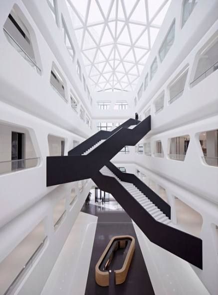
An Atrium is essentially an open-roofed entrance hall or central court in a structure. Typically, atriums were the entrance lobby or forecourt in churches, however, they have found an integral place in modern architecture. An indoor central hall with a double height or rising through several stories and having a glazed roof is termed as an atrium. They are fairly common in public buildings like malls, hotels, schools or concert halls. A double height space is all about creating a first impression – it shows off the grandness of the structure or simply conveys its essence. Let us learn about them through a series of curated examples!
CULTURAL COMPLEX, SWEDEN
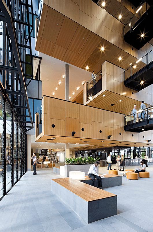
What sets an atrium apart from a courtyard is that it is covered at the apex. A courtyard is open to sky, whereas an atrium, even if its multi-height is closed at the roof. The Cultural Complex in Sweden is an example wherein the atrium ties the whole building together. The projecting cubes at various levels adds a dimension in the atrium, even though it is a largely open space. It highlights the asymmetry and lends a feeling of magnanimity to the space.
FORD FOUNDATION GALLERY BY DARREN WALKER & LISA KIM
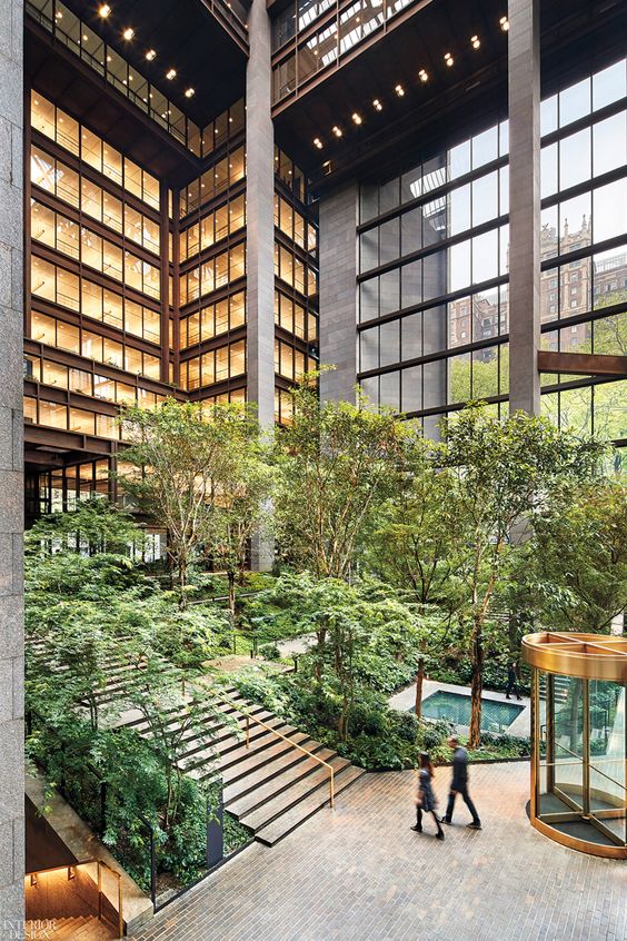
The Ford Foundation Gallery serves as an excellent example for an atrium that really connects the entire building. This type of atrium makes for an inward looking structure as well as becomes a private-public space for the users. The indoor garden and small water bodies welcomes the user, tells them about the building and acts a transition space from the outside to the actual inside. Kudos!
HOUSING COMPLEX, BORDEAUX BY AGENCE NICOLAS MICHELIN

An atrium doesn’t necessarily have to be at the very beginning or centre of a building, which is intelligently shown in this example. The four storey housing complex uses the atrium concept as a connection between two stand alone structures, covered at the top, running all the way along two buildings. This is a genius idea, as it makes the user feel inside and draws focus to the linearity of the buildings with the bridges providing visual relief. The zig-zag walkways also break the length and add value to the design.
LEEZA SOHO TOWER, BEIJING BY ZAHA HADID ARCHITECTS
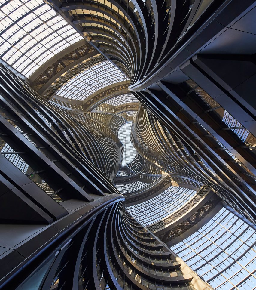
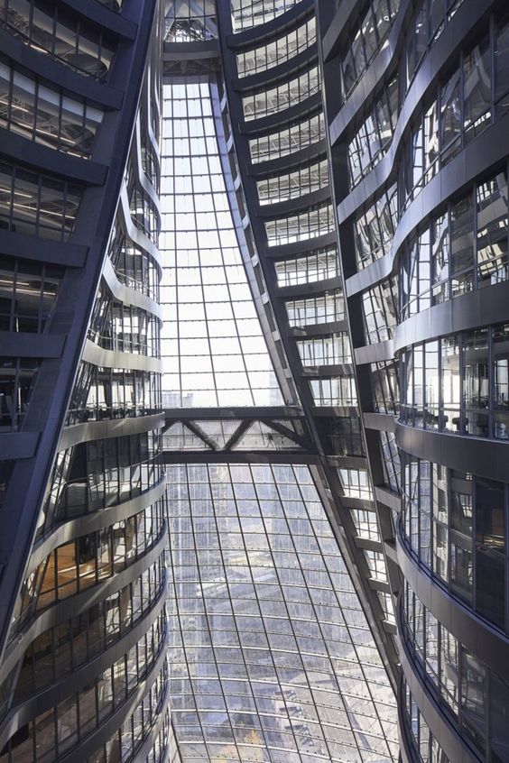
The World’s tallest atrium was recently completed at the Leeza SOHO Tower in Beijing by Zaha Hadid Architects. Not only is this a master lesson in the design of atriums, but it also showcases the brilliant use of materials, form and geometry. The enormity of the tower is clear to the user upon entering. The culmination of curves at the top, the glazing along the form and the climax of the atrium, truly an architecture marvel! In this case, not only does the atrium create a lasting impression, it truly connects the building vertically, across the atriums, to the outside as well as inside.
NOVE, GERMANY
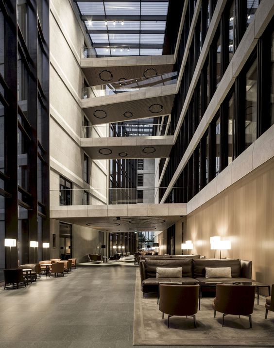
This type of atrium is fairly common and is seen widely in malls and hotels. Either centrally located or placed at one end, this atrium is divided by large canopies or stairs or bridges connecting two corridors. This creates a hierarchy in the design, grand and covered, open and covered and carves spaces for public activities. This technique is helpful for malls, as visual connectivity is maintained throughout enabling the visitor to see all shopfronts and also creates space for big advertisements, installations etc. for promotions.
MISCELLANEOUS
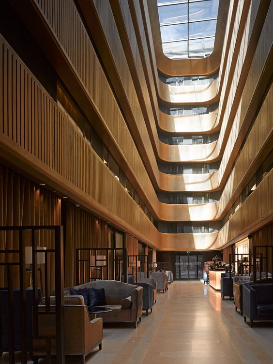
The Pavilion Hotel by Flanagan Lawrence is a classic example of courtyard planning with a central covered atrium. In large commercial, office or apartment buildings, with many different units, ventilation is needed from both sides and thus a courtyard planning is used. In this case, the hotel being a centrally heated building, the central atrium is covered with glazing, which admits diffused sunlight and carves out a central public boulevard.
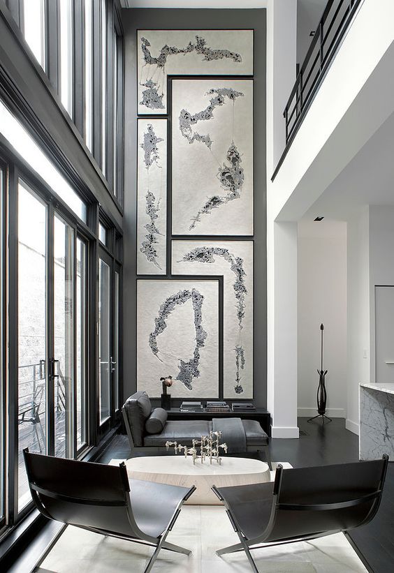
This Row House in Chicago by Lukas Machnik exhibits how double height spaces can be used in private residences. This double height family lounge with a spillover deck and an upper canopy opens the house to a glass facade making the interior light and airy. It connects more than 4 spaces in the house with the mural emphasizing the vertical even further.
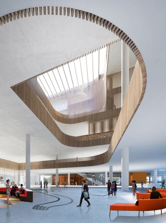
The Shanghai Library by Schmidt, Hammer and Lassen is a play of levels. The shift in scale and height combined with the interesting intersections of the upper floors makes this an interesting atrium. All eyes dart upwards, owing to the vertical columns, wooden batten railings and culmination with louvers.
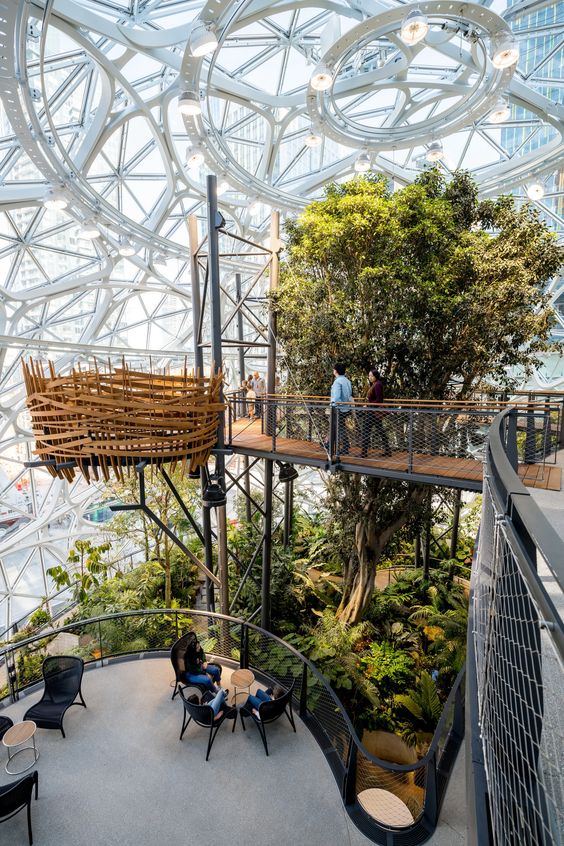
Spheres at the Amazon Headquarters by NBBJ is another example of a well designed atrium. It essentially binds all the different pockets of seating or decks with a central garden which is covered by a geodesic dome like glass structure.
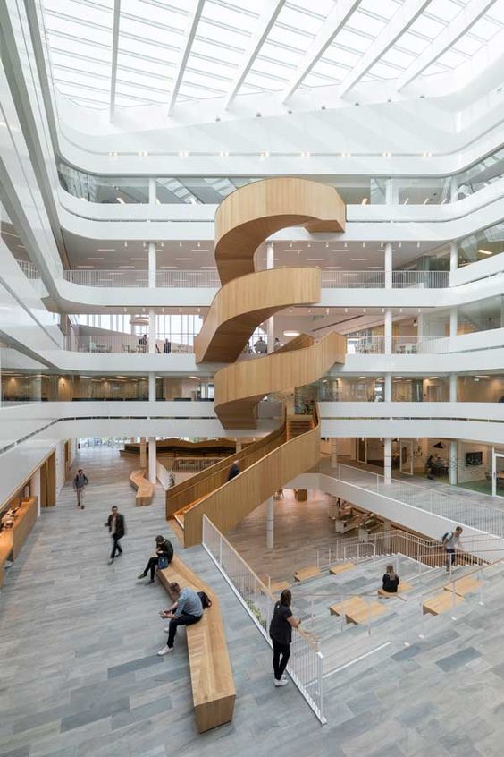
The Uppsala University uses the atrium as a public forum with a central amphitheater and a statement staircase clad in wood. The serene white building with a glazed roof, is divided with central white passages and a dominating wooden feature staircase and hints of wooden furniture and grey undertones. A perfect combination of form, design, material, color palette and a lesson in simple yet amazing design.
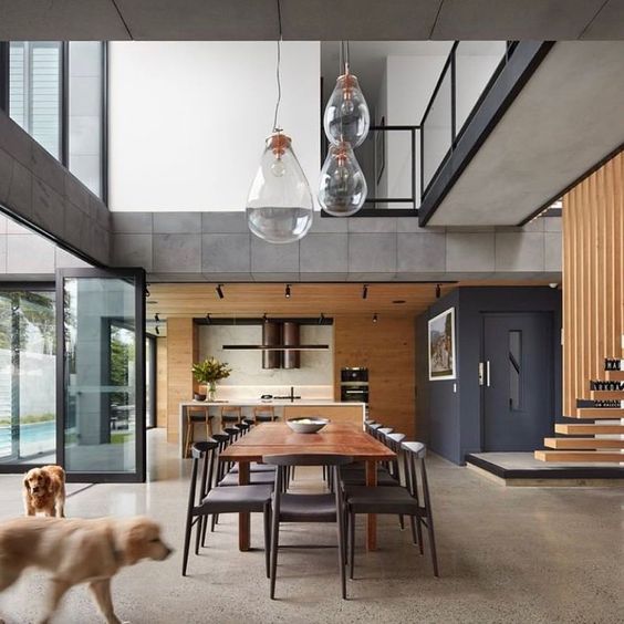
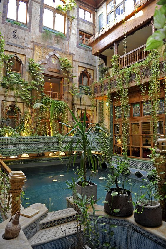
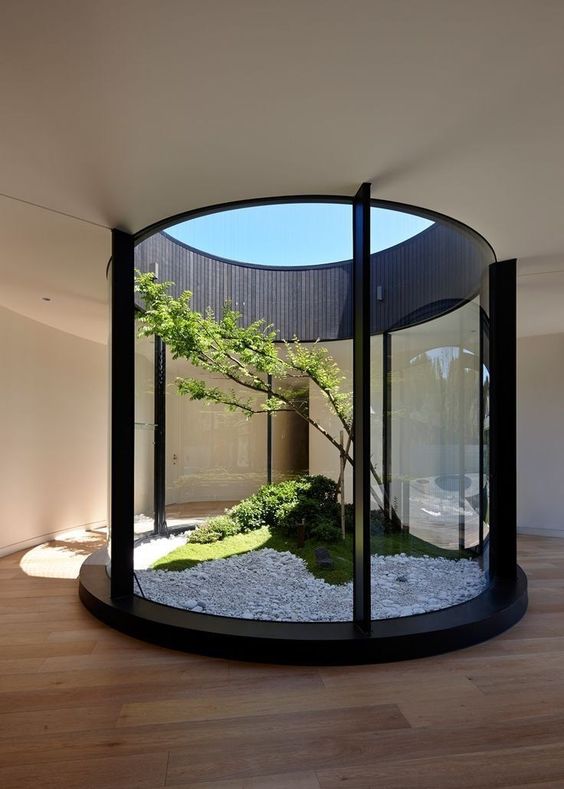
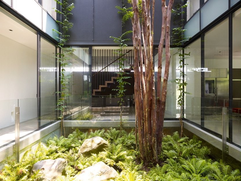
However, in order to integrate an atrium or a double height space, the structure need not be so grand. Even small homes can have a central atrium, which provides light, ventilation and connects the house visually. Here are some examples.
