Sometimes long corridors are unavoidable in a building plan. Lengthy passages inside a structure, may be due to the site’s awkward shape or even the function of the building. For instance, an apartment or hotel has many units on one side, resulting in long transition spaces on one side or in the center. Sometimes, corridors are even introduced as a feature, to convey scale, express the design style or because the structure is just big enough like in the case of malls or schools/colleges. But, these corridors are often neglected and the ‘ Interior Design’ is restricted to the inside of every unit, room, shop or class. The corridor is simply tiled and lit, but kept bare and boring. Passages are an integral part of any building and used by everyone, thus they deserve more attention. Here are some ways we can deal with corridors in Interior Design!
ARCHITECTURE FEATURE
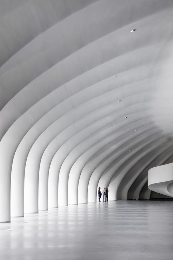
A series of arches, french windows, glazing or a colonnade is a good way to make a corridor more interesting. Peripheral corridors in huge public buildings like concert halls, stadiums, art galleries etc. can incorporate architectural features to enliven the corridors. These features will not only make the exterior facade more interesting, but also lend a beautiful light and shadow effect inside, while also fusing the outdoors with the interior.
FEATURE WALL
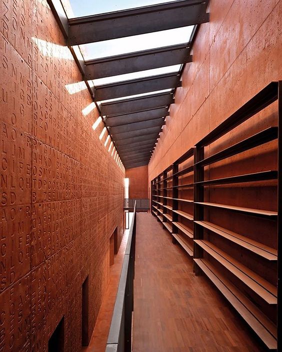
Passages highlight the length of the space. In order to create a shorter illusion, the passage could be adjoined to a captivating feature wall. Walking by something which captures your attention, while also communicating the design theme of the space, makes a corridor feel shorter and more in sync with the rest of the building.
CURVY CORRIDORS
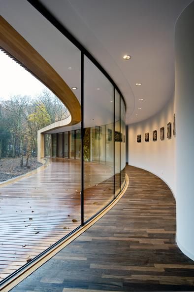
A long narrow corridor, is opened up with floor to ceiling windows and an adjoining wooden deck which makes the corridor feel larger than it is. It is further enhanced due to the form of the Villa, the curve making it seem shorter. Attention is commanded by the outdoor view and the adjoining inner wall is kept plain white with small pictures adorning it.
SEATING GOALS
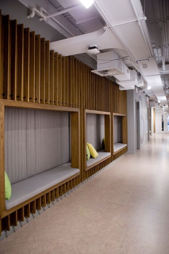
Long corridors in office spaces can be utilized as a storage area/printing area/small cafe or in the above example – for seating. The space is treated in the same industrial undertone with exposed ceiling and a niche seating on one wall. This results in an engaging public space for employees rather than being a long walk one has to traverse. This also creates an environment for interaction and enlivens the corridor, a transition space, into a much more usable part of the office.
SNEAKPEAK
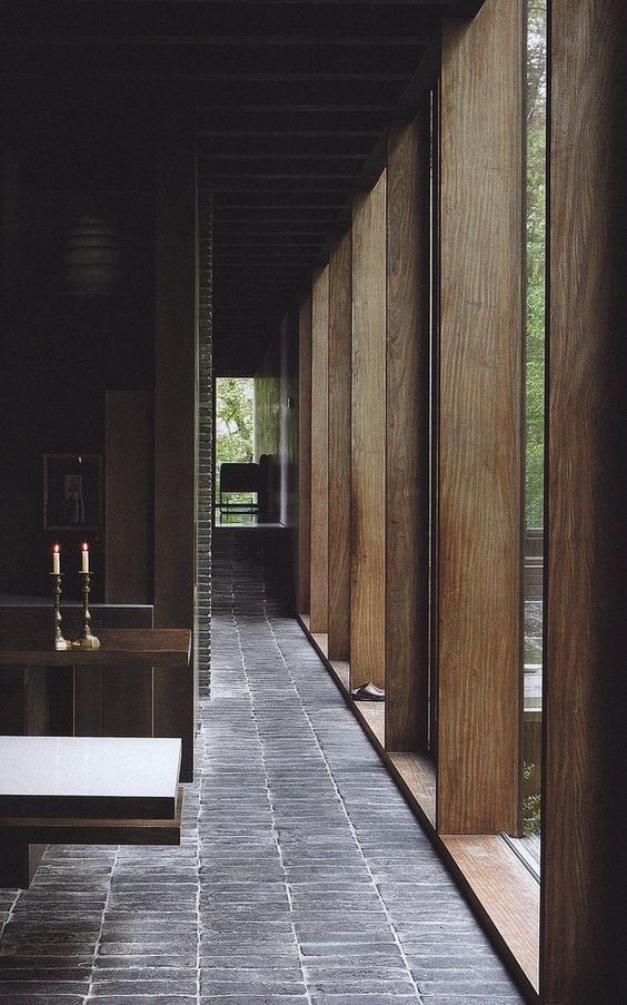
In case the corridor opens directly into living spaces where full glazing is not an option because of privacy issues, the above example is the perfect way to charge the corridor. The private garden is brought indoors with floor to ceiling fixed glass panes, but intersected by large wooden louvers which allow light and view, but with a hint of privacy. The dark interior space is lit up with natural light, but the strategically placed wooden louvers ensure seclusion.
COLORS AND PATTERNS
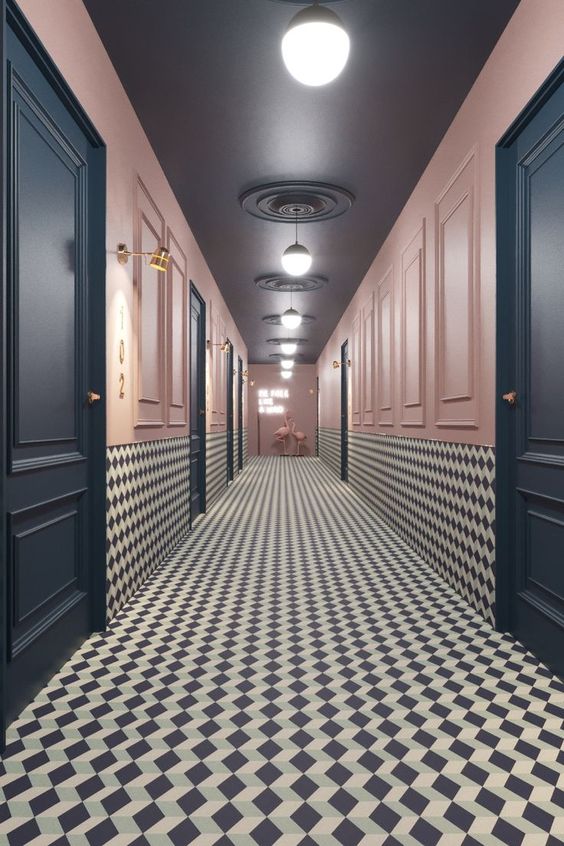
A funky way to dress up corridors is the use of bright colors or patterns. The above example uses a busy pattern for the floor and wainscoting and then neautralizes that with bright pink walls and dark blue doors. The flamingos at the end and lighting further jazz up the space.
WINDING PATH
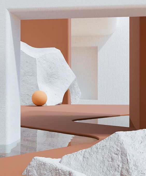
Treating a corridor becomes easier when it is part of a space, for example in museums or art galleries. The corridor is then more of a pathway in the space and can be treated effectively with paintings on show, sculptures or installations. In the above example, the corridor is a zig zag pathway along the various exhibits and integrated well within a space.
CLADDED ELEGANCE
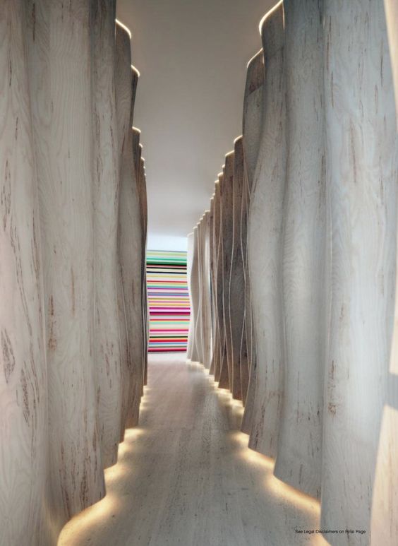
A simple yet effective way to deal with corridors in interiors is to clad the adjoining walls with interesting materials. A wooden batten cladded wall or in the above case this wave feature wall is a good example of this style. The user is distracted with the beautiful styling on either walls which makes the corridor less long and less boring. Diffused lighting or small details like cove lighting also help in elevating the design.
MINIMALIST APPROACH
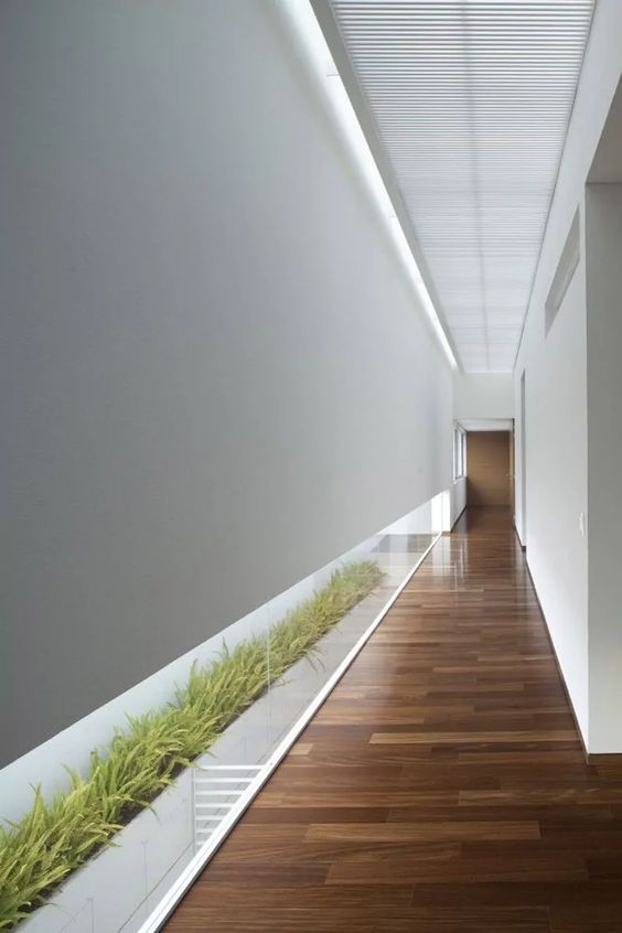
When the budget doesn’t permit extravagance, a sleek and minimalist approach towards corridors is the way to go. Elegant flooring combined with pristine white walls and ceiling can prove to be a good option. To add more finesse to this simple space, planters have been added behind a low glass window for diffused light as well as complete privacy.
ALTERNATE WAYS TO DESIGN CORRIDORS
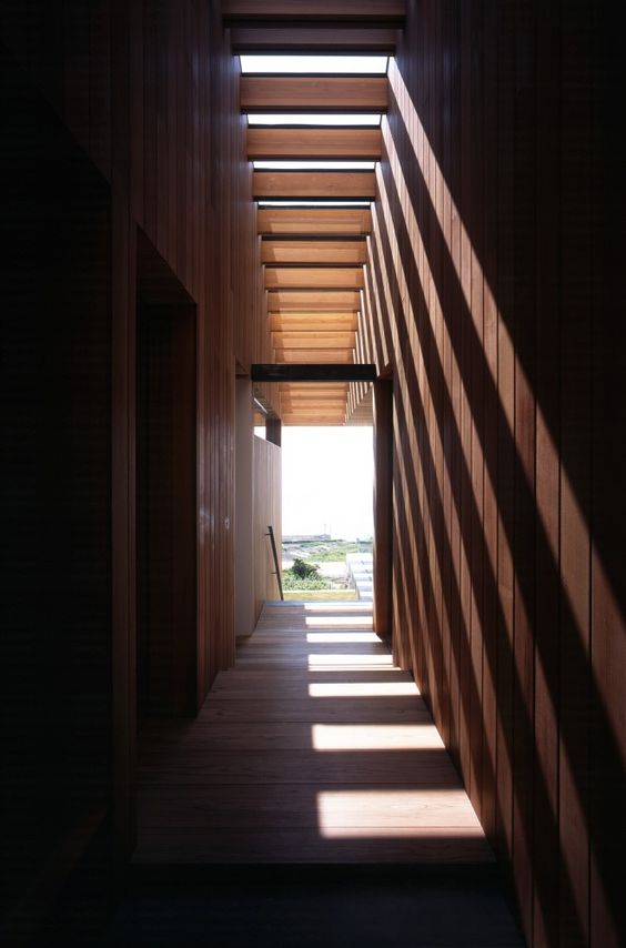
Another way to tackle a closed corridor, is a skylight. It instantly lights up the space and can help a dingy passageway transform into a playful transition.
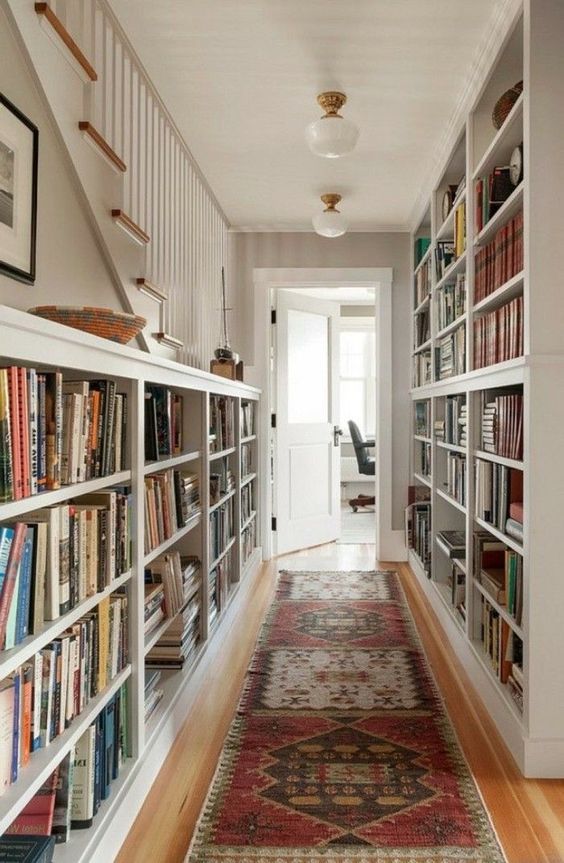
Small passages in private residences can also be utilized for clever storage. A wider corridor can have dressors, chest of drawers or even full book shelves on either side. This unused space can then be used to display a full library, artefacts, a wall mural or feature in the house. Hanging a mosaic of family photos above a mantel or shoe rack is also a great way to treat the corridor.
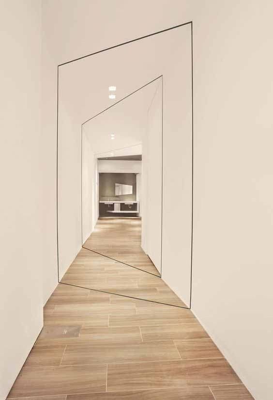
The niches and projections of spaces in this corridor gives it an awkward shape. Instead of lining the rooms, the designer has further enhanced this defect by treating it cleverly with more geometry. The black outline in a slightly shifted axis going all around the corridor emphasizes the form and makes for an instagrammable space.
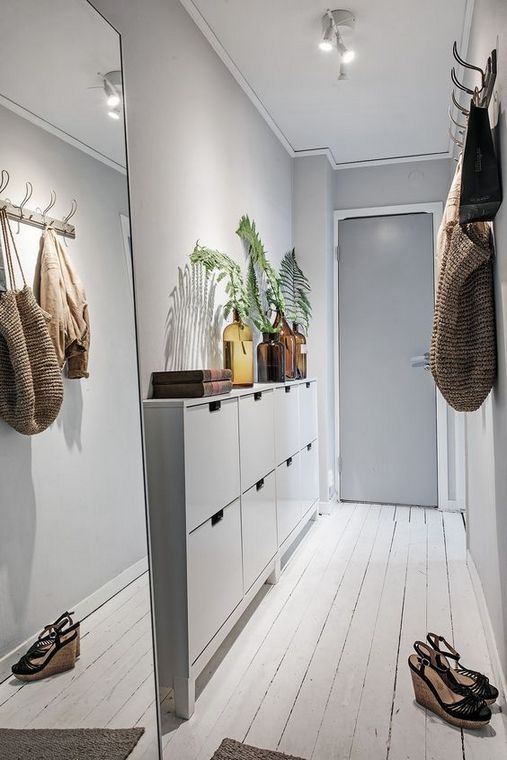
In narrow hallways, it makes sense to have super sleek furniture, like this shoe rack in the above example. The matching white to the walls and flooring makes the furniture look lighter and the plants above it give it some edge. A coat or key hanger, a family frame are also nice accessories for a hallway. The best trick to make a narrow passage appear larger than it is, is to place a big mirror on one wall. This can be done over a mantel, a dresser or a credenza. The mirror also helps you take a last look at yourself, before heading out. Win win!
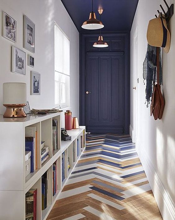
A homogeneous design is one which pays equal attention to every part of the building. The culmination of all these parts make the overall space a success. However, the key is to think about all these spaces together. The same design theme and idea should flow in the key spaces as well as transition spaces like corridors, lobbies, stairs etc. I hope the above examples help you in your quest of dealing with corridors in interior design!
