Mies Van Der Rohe, the great architect and artist once said, “God is in the details” and he couldn’t be more spot on. A space is made up of the dozens of thoughts, ideas and concepts architects and interior designers conjure. These brainwaves of design, are then translated into reality, using minute interior design details. This attention, given to the smallest of elements in a space, are responsible for making it come alive and rendering a finished suave look to any space. An incredibly designed place also falls flat, if the little things are not considered with scrutiny and dealt with the same amount of contemplation as bigger masses.
We have curated a special list of some of the best interior design details, we came across to prove our point.
1. FENESTRATION:
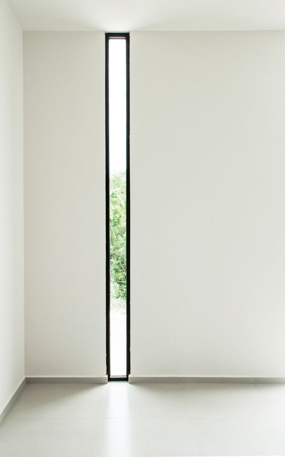
Are aluminium sliding windows, or windows with a certain sill and lintel or wood frame windows the only options to introduce light in a room? This window slit, by Plataforma Arquitectura, from floor to ceiling, ensures enough sunlight to seep through in a space, without adding glare and discomfort in the form of heat. It looks amazing, and adds a dominant element in the white space.
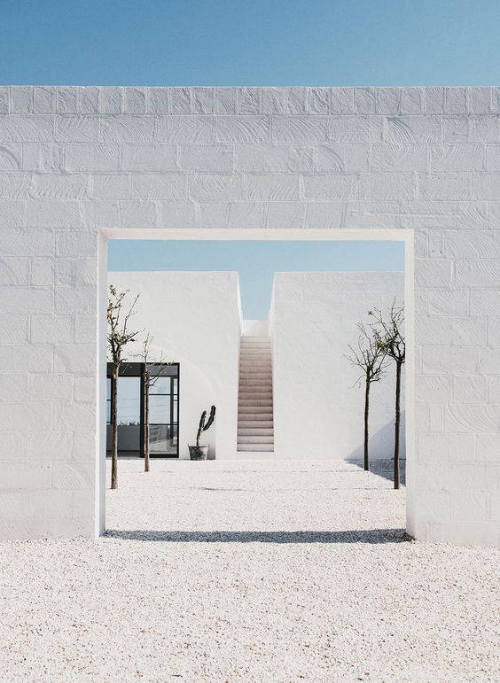
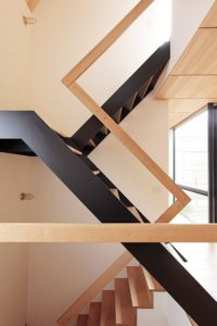
This simple idea, looks absolutely stunning as it frames the simple staircase going upto the terrace. It is simple proposals like these, which add depth to a design, and make it a frameworthy experience.
A bay seat, in a busy cosmopolitan city, makes for a perfect spot to read, look out, discuss stuff and just ponder over matters to get clarity of mind and heart. This full glass window, edged out of the building facia, with a seat wedged into it, is the perfect example of a cosy corner with the view of the world.
2. STAIRCASES:
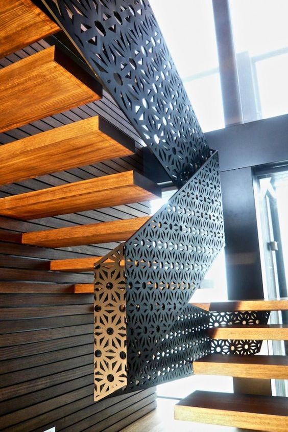
Staircases are often misunderstood as only vertical transition spaces, and simply neglected in the design process. Standard staircases with no special treatment or attention can be seen in dozens of places. However, this particularly staircase is richly highlighted with floating wooden steps, and wrapped with intricate metal jali as the parapet, giving the modern floating stairs a contemporary twist.
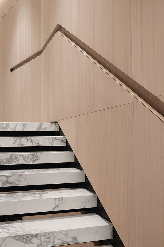
The niche in place of the projecting hand rail, in this simple yet elegant detail, saves cost, space, and material. By carving a niche like rail, in the wooden wall panelling, the designer has shown ingenuity even in the minutest element of his design, which is noteworthy and truly inspirational. The combination of marble with the subtle wood fascia is striking and adds drama to the simplistic overall look.
Black and brown, a timeless combination has been used effortlessly in this modern contemporary staircase design. Instead of hiding the beauty of the staircase, the designer chose to replace the closed parapet, with a wooden batten handrail, making it edgy and super stylish.
3. PARTITIONS:
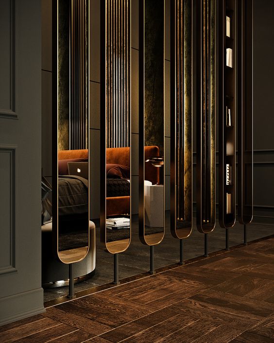
Functional elements like partitions and separating walls, need not be drab and boring. This fun mirror partition, propped on iron stands from floor to ceiling, not only divides a space, but gives it an aesthetic appeal. The mirror on both sides, visually enlarges the space and adds depth. This minimalistic partition, gives partial vision to both the space, while also providing adequate privacy and panache to the room.
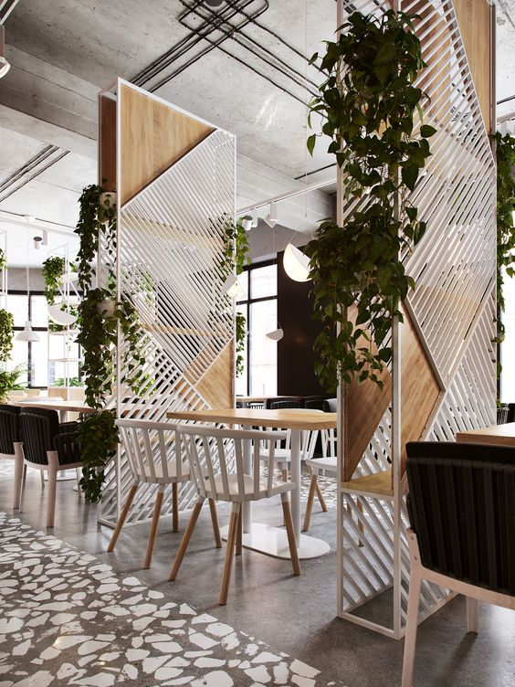
A partition, cum planter stand, cum shelf, cum dominant feature, this amazing detail makes it possible for it to serve multiple functions making this one of my favourite designs. The assymetrical battens and interspersed solid wood boards add interest to the element, and go perfectly with the overall color scheme. This design is not just extremely easy to achieve, but the output is engaging and absolutely beautiful.
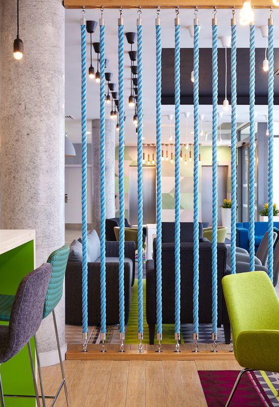
Whats the easiest way to divide a room you ask? How can you build a partition on your own? The answer is ropes! A simple wooden batten, fixed to the floor and the ceiling, with ropes attached to it using hooks and voila! You get an instagram drool worthy partition, at about no cost at all, with the look of a million bucks. Paint the ropes in bright colors to add some life to the space, and there you have it! A perfect modern contemporary divider! Love it for its effortlessness, and young appearance.
4. FURNITURE:
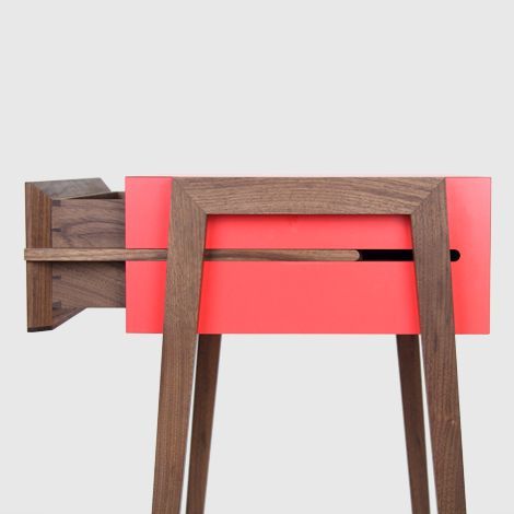
Smooth, sleek, light and brilliant looking, is all we want in a piece of furniture. And this uber sleek drawer design is all that. Making everyday use things easier, and more functional while lowering the cost is the job of every designer, and this red and wood drawer table inspires just that, a design that offers solutions while looking amazing!
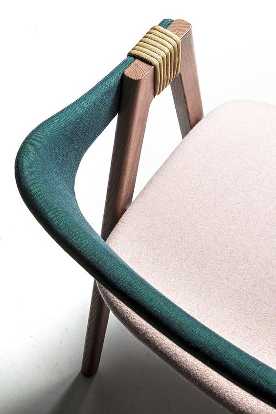
This chair design is awesome. Enough said. The backrest overlaps the hand rest and is then fastened by rope and secured into place. Needless to say, the colors blend well together, making this chair look chic and urbane!
Pillows are always falling off a settee. Everyone knows that. But who fixes it? Well, this chaise makes sure the pillow is secure in it’s place. The vertical support extends a little over the cushioning, and culminates in a certain U, enough to hold the pillow where it is. The stylish design, combined with the solution of one of the oldest problems, is why this piece of furniture made it to the list!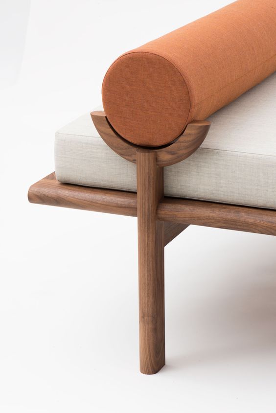
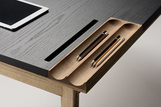
This design is so obvious, I’m surprised we are seeing it only now. A recurring issue, solved with a beautiful detail is what furniture design is all about! Thanks for pointing out that tables will never be the same again. A curved appendage to hold your pens, and a slit to manage all your wires in a sleeker way, just makes me want to applaud!
4. LIGHTS:
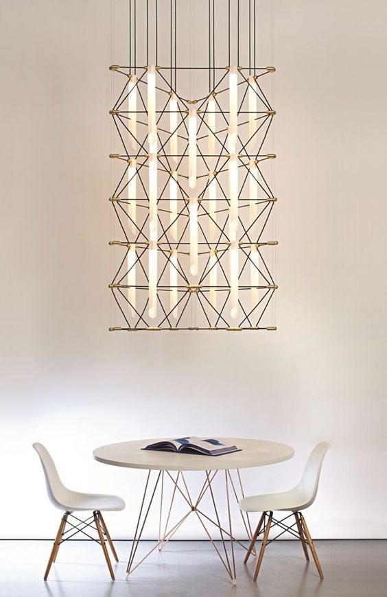
Wires. Metal. Lights. This incredible fixture, owing to its modulable design can be stretched and height adjusted to form a chandelier as well as a space separator. Whats more is, it looks futuristic and will add value to any space.
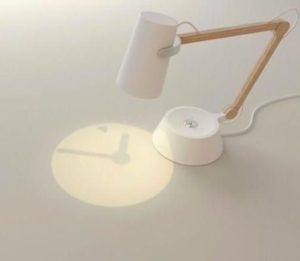
A table lamp which projects the time is an ingenious idea, for students and professionals. This stunning design, with yet another intelligent detail, deserves to be admired.
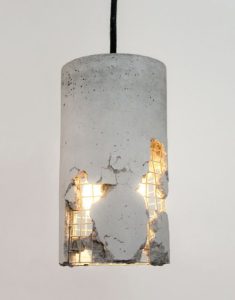
Beauty in rawness, is also beauty. This cement light fixture, with its frayed ends, exposing the metal mesh within while giving diffused light, is truly remarkable.
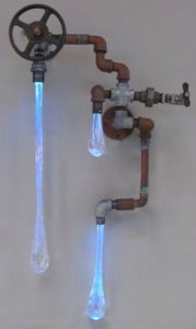
Water droplets in the form of light, from this industrial piece spells brilliance. The pipes hide the wires, while the fluid droplets diffuse light. Product design at its best, this fixture makes for a great conversation starter as well as a feature in any space.
Details are what makes a design. Never underestimate their importance. Be it architecture, interiors or product design, observing the small parts and giving them equal importance is what will lead to a wholesome design. Keep it simple, classy and detailed!
