Most often than not, designers get limited with their presentation styles. Students get trapped in the deadlines, architects get restricted by clients or labors who are going to read the drawings. Architectural representation of an idea is the artistic way of expressing the building. It is to resemble the concept and detail of the actual design, but somehow also convey the essence of the project. There are many different ways to tackle the presentation style, so as to make the project more interesting, more eye-catching and easier to understand. Let’s take a look at some different architecture presentation techniques we can incorporate in our portfolios.
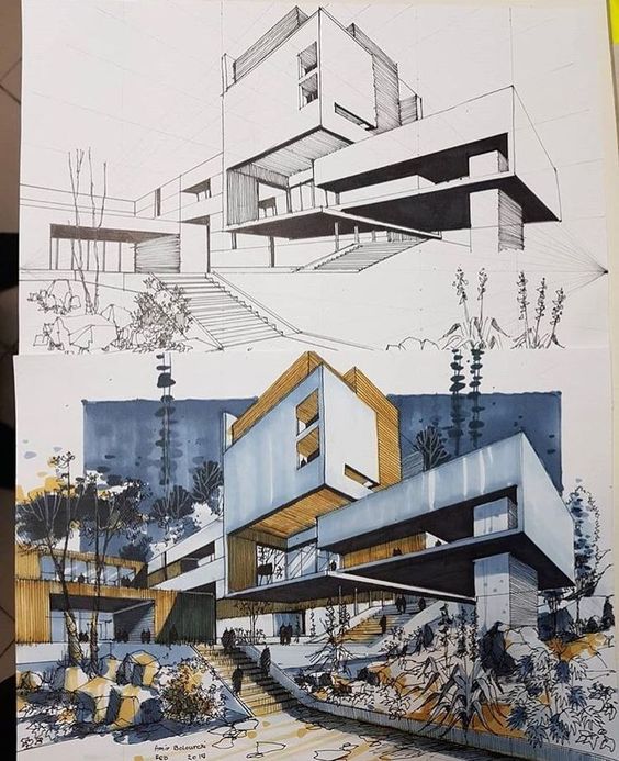
Pen and Ink – Hand Drawn Presentation
A fine example of architectural presentation is the pen and ink style. It can also be called the manual style, whereas one isn’t restricted to only pen and ink, but is also open to water-colors, pencil sketches or any other manual technique. This style has somewhere gotten lost with all the softwares available these days to an extent that designers hardly touch paper. This style is one of the simplest and most beautiful as it is not perfect, sometimes there are jagged lines, or color not within the lines, but it just adds to the aesthetic. For people who want to achieve this presentation style, but aren’t as confident about their drawing skills, don’t worry! There is a way! One can simply draw the basic sketch or outline of a drawing, and then digitize it using Adobe Illustrator or Photoshop. These softwares allow one to take a hand drawn sketch, increase or decrease line strokes, color in them and add effects such as shadows, digital trees or other elements. Overall, this style is very appeasing and gives a more personal and dedicated impression.
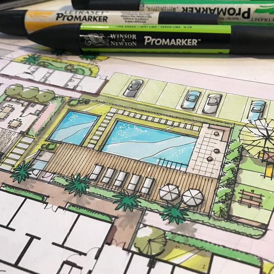
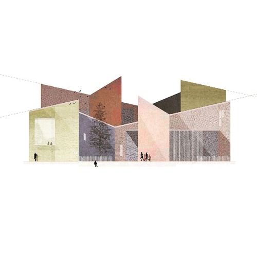
Color Blocking – Using colors for dominance
A very elegant example of how colors can be used in architectural presentation styles to make elements stand out. Mostly used to denote massing in a 2d drawing, the color blocking technique is very obvious, but very attractive. Designers can chose colors depending on the number of elements, or based on the heirarchy of masses. So, the colors can be a variation of shades, for eg. one color used in different hues, or the same color tone, for eg. neutral or earthy shades, or bright colors used in the background with the drawing in plain white in the foreground etc. etc. There are n number of permutations and combinations which can be tried in this style and each would give an interesting result.
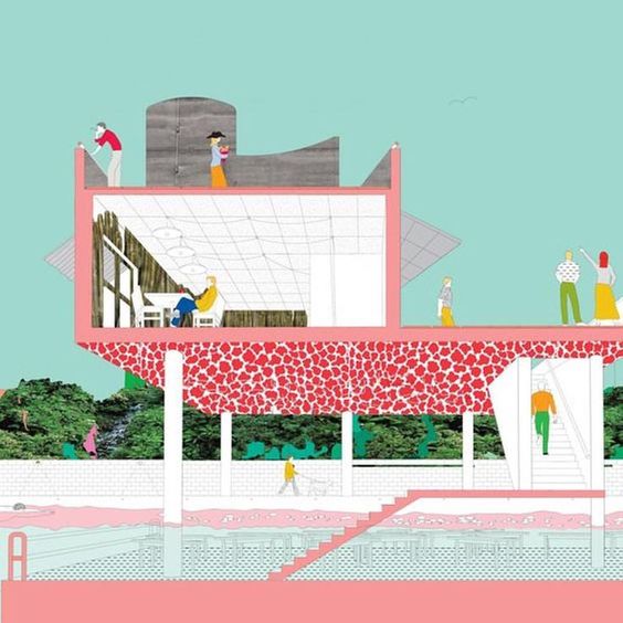
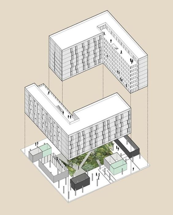
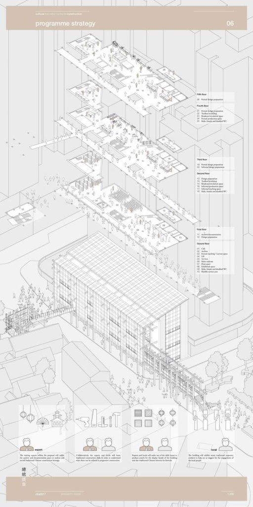
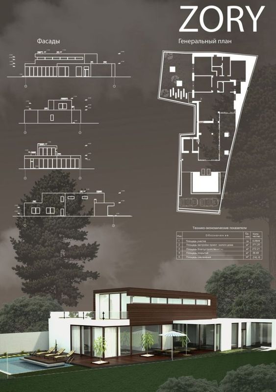
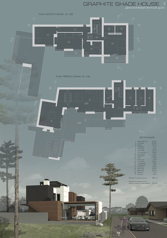
Axonometric Style – All in one drawing style
One of my favourite techniques for presentation, the axonometric or simply axo style is according to me the easiest to read. Using an axo view, the designer can very well explain the concept and the inter-relationship between various stories, the play of levels or heights, as well as function of every space of the project. An all in one technique, this one diagram is enough to explain the plan, the facade, the inner details, sections and view of a single building. The axo can also be drawn in a variety of ways like sectional axo or floor plan axo etc. to explain further details. This technique is especially useful when the floor plate needs to be explained in minute detail, whereas the facade is a continuous element on all sides. It also conveys the process of design, for instance the steps in the making of the building. What’s more is, this style is the easiest to achieve on software, making it a go-to for students and small firms.
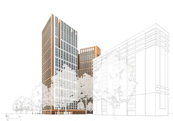
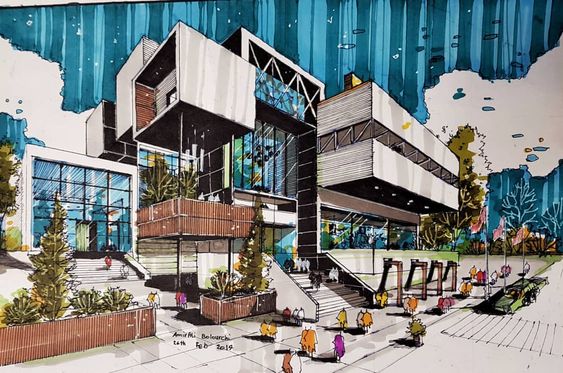
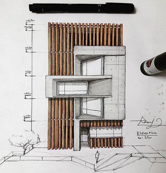
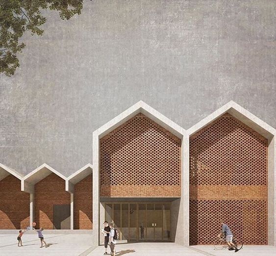
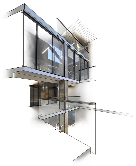
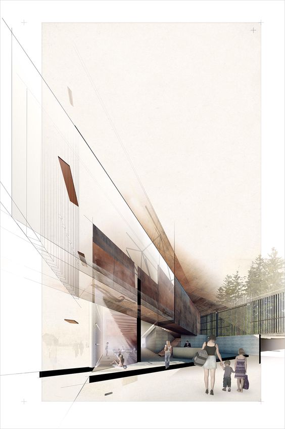
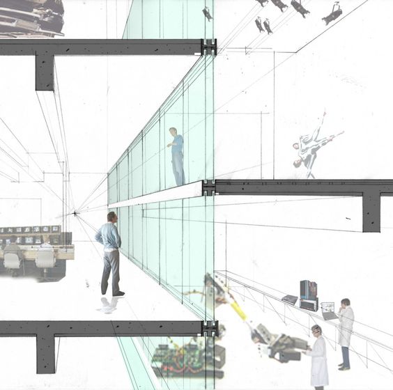
Perspective Drawing – 3D visualization
A 3D render is the best way to express what a designer has in his/her mind. The client understands the atmosphere of a space more than a 2D drawing. The sense of scale, colors, textures and feel of a space is best conveyed in this technique. There are a lot of ways to achieve 3D renders, especially with the tools available nowadays. It can be a photo-realistic render or a photoshop collage or a wireframe or white render. However a perspective drawing, where one has the sense of actually being in the space is my top pick. The angle or the camera placed is the most important thing in this style. Where the view gets cut and the kind of textures and colors one uses, with the correct light and shadow setting is also very essential.
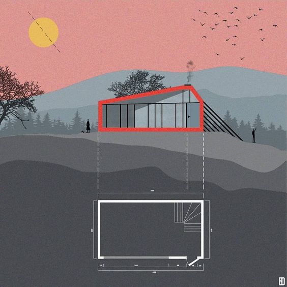
Info-graphic – Minimalist drawing style
The single line drawing presentation styles is used extensively these days, where the presentation appears to be more an info-graphic than an architectural drawing. This style is used mostly when the 3D view expresses the major portion of the design and the elevation and section drawings are merely present for further understanding. Often, drawings are not even part of the scheme, only a few details or plans are expressed, in single line for conveying the volumes. This style is perfect for architectural portfolios, where one project is to be displayed on one sheet, where there isn’t much scope for a lot of drawings.
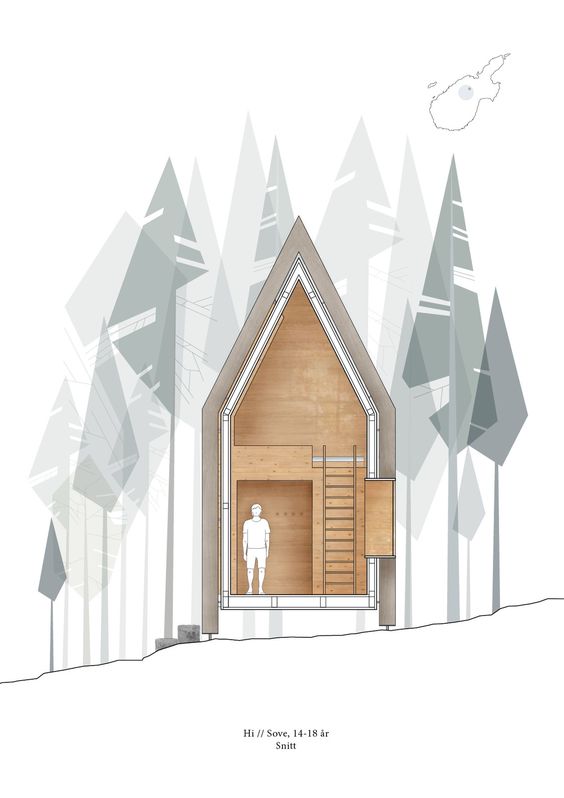
Geometric Style – Clean lines and shapes
Sometimes, the drawing or the main focus of the project is lost in context with too many shapes on the sheet. The geometric style expresses everything in sharp straight lines. The absense of organic drawings in the form of trees, cars, etc. or expressing them in lines makes it more interesting to look at and doesn’t distract from the main project. This style is very eye-catching and extremely easy to achieve. Another way to add to this style, is by playing with the opacity of elements. For example, elements which have a more complex shape, like humans or trees, can have a very low opacity as opposed to the main components of the sheet like the facade etc. In this way, the project is highlighted and other elements, while present, do not overpower the sheet.