
CV or curriculum vitae is one of the most important document you will possess in your professional life. It comprises everything; your work experience, skills, and other important details. But more importantly a good CV is also an indicator of your design and presentation skills; an extremely important skill to have in today’s world of design. Khushboo Agarwal, Asst. Prof. in Jhulelal Institute of Architecture, Nagpur has some pointers that will not only help your CV look good but also increase your chances of getting that dream job. Read on.
It’s ok to have white spaces.
It’s not necessary to fill in each and corner of your portfolio with something. Many people put in the background image which is absolutely fine, only if it doesn’t conflict with your content. But do not waste your time struggling to find the right image for the background thinking that ‘the white space’ won’t look good and your folio will look empty cause of that! Do not stress yourself if you don’t have the background. You need that white space so that your content can be read clearly and it’s not chaotic.
Have a cover page.
The very first page of your portfolio doesn’t have to start with the index or CV. Have a cover which can be an image of best view of your best work, some photograph you clicked, some sketch, nicely rendered plan, some collage, design process sketches/views or anything else which you would really love people to see! Just take care of colors. Don’t have colors which don’t go with color scheme of your folio. And yes, it should mention your name and qualification. Something like magazine covers.
Limit the number of pages.
Do not have 30 pages in your portfolio! The person looking at your portfolio will not have the patience to go through 30 pages! He will lose the interest, and having so many pages will only increase the size (mb) of your folio. Also, communicating maximum information in minimum space is a skill; one that is liked by employers across the board. Have a single page CV ONLY. Do not let it spill over to the second page in any case. And yes, having a cover image doesn’t mean that you wasted a page. Classifying the number of things you would like to show and dedicate them number of pages as per the importance and details you want to show.
Use online portfolio links
Go one step further and use online platforms to upload your portfolio. This indicates different thinking and adaptability to new technological tools. However, first you need to check whether the platform is easy to use for the viewer. Does it zoom in and out easily, is it easy to flip through the pages, and does it uploads fast while viewing. Again, it will depend not only on the size of your folio and images but also on the host! Few websites that you can use include are –
Coroflot.com
Behance.net
Carbonmade.com
Viewbook.com
Format.com
cargocollective.com
Dribbble.com
Wix.com
You can also have webpage on some websites which can really help the viewer to see you work in an organized manner.
Have images in good resolution but beware of the size
Have images with good resolution. A de-pixelated portfolio is a big turn off. But also remember that very high resolution images will make your folio heavy. Size of your folio can be 15MB max! If you put images with 72 DPI, it usually gets depixeled. It also depends on how much you stretch images. If you want to have bigger image then 300 DPI can be good but it will make your folio heavy. Average size images you can be 150 DPI.
The final version of your folio will be the PDF which you will get after exporting from the software you are using. While exporting you set the resolution of complete folio as 150 DPI, which is neither heavy nor will it de-pixelate. Therefore, you put your images as 300 DPI and then export the whole file as 150 DPI. It should give you good result.
Contents of folio
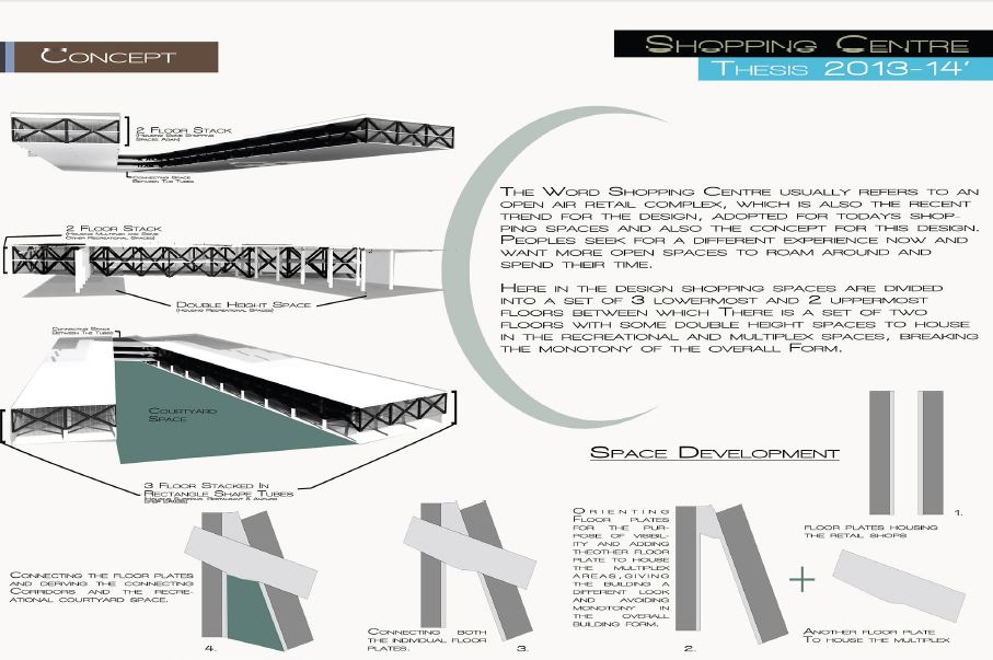
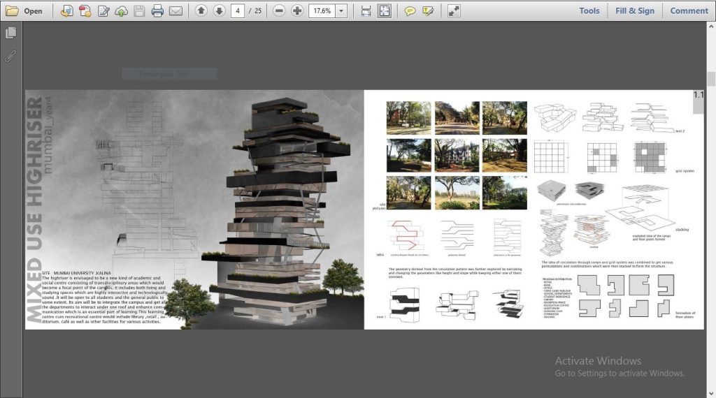
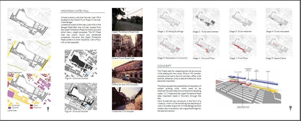
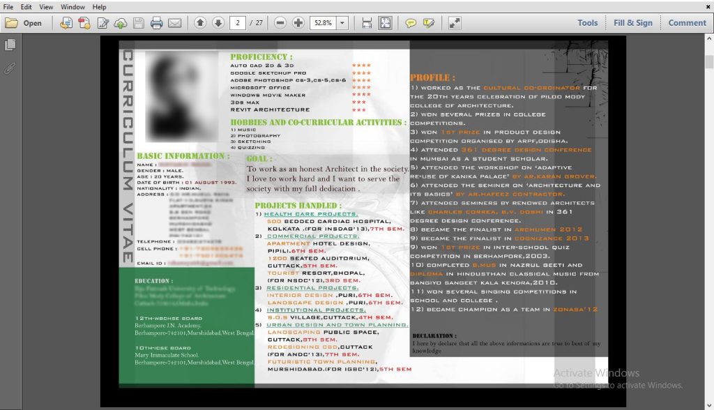
One should cover all kinds of projects and skill sets. You can have logo designs, webpage designs, product designs, visual art work, sculptures, paintings, college work, personal works, etc. and of course interior and architectural projects. You should definitely put in your unbuilt projects; it will show how dedicated you are. Show your sketching skills, rendering skills, model making skills through your work. And, it is really not important to put sketches, don’t stress yourself if you don’t have any but it is important to show your ideas, thinking process and design capabilities.
You should definitely put in a teamwork project which shows that you are a team player. Mention competitions, voluntary services, places you travelled, conferences, blogs, freelance work, exhibitions and every feather in hat. And please, please do not put your parents name in CV. This information won’t pursue the employer to hire you! Also, not even your school grades.
Order of contents
IN CV – Basic information’s comes first – name; gender; contact information; council registration number; your photograph; clickable links to your online CV, LinkedIn profile, fb page, blog, webpage, portfolio, etc.; aim for applying where you applying which will change if you applying for a lectureship or as a designer in some firm; career objective; qualifications.
Then mention the last job you had. Mention city, year and a short description of what you did there, your role and what you learnt. Your work and your job come in the descending order. Last thing you did appears first and then things before that.
Serif or San Serif!?
The font that you use is a very, very important factor. You might spend hours searching for the right font online, well you have to be that conscious before finalizing it. But the right fonts are fonts you already have in your system. It is not about which font you choose, it is about how you use it! Never use more than two fonts, one for the heads and one for body of the CV. One can be serif other can be san serif or both can be serif or both can be san serif. For labeling, use fonts which you used in body BUT change their styling – reduce size make them italics & change color.
Use formal fonts, no comic sans and family (obviously). Helvetica is common but it’s the best. Also, remember, if you are making folio in PDF format, which you most likely will, then be sure that those fonts are available in the viewer’s system as well. If you use way too different font and the viewer doesn’t have one then you are doomed! So, in spite of Helvetica, Swin721 BT, Georgia, Segoe UI being very common and obvious choices, it can certainly save you from any disaster. Fonts have to be very easy to read, it should not cause any stress and please create a system for fonts hierarchy. Too much variations or no variation at all will bring chaos.
This doesn’t mean you can’t use any fonts from millions of fonts available online. Just make sure then that you are having your folio in jpeg or any other image format first then convert it into PDF format.
Software to use
Adobe InDesign is the best software ever to make your folio!!! DO NOT USE MS OFFICE. InDesign is as easy as word. Edit images in Photoshop, bring them here and put it in your grid. It’s absolutely the best software to align things just right! And you can export your folio easily to pdf with whatever resolution you desire along with clickable links embedded in it.
Have a grid
Identify a grid which best suits your work and have a consistency in each page. There has to be a constant margin, consistent spacing between images and write-ups, two images, and two write ups. If the captions of the images are coming below the image on right-hand side bottom corner then it has to be there throughout the folio. Make your own system and follow it obsessively. A grid will make your work very easy and a consistency will give and ease to the viewer.
Colour Scheme
Yes, you need one. But again restrict yourself with just two colours or one colour and use tints and shade of that. Or take two neutral colours and one bold. For example, black and grey are neutral colours and add red, blue or green or orange with it, or Black, Algae green and Green. Your images will have colours, so no need to add more colours with fonts. Keep it subtle.
Also, check if the colours are looking fine on mobile screens, Apple, Linux and Windows. Colours, as you are seeing on your screen, might not appear the same in the viewers’ screen depending on their medium. What if when you go for the interview, they have the copy of your folio printed in black and white? Images will certainly lose their charm but if you had created hierarchy in fonts wisely then you could have saved the whole essence of the folio even in black and white. So do not depend so much on colours.
Lastly, do add a smart picture of yours. It shows that you are confident in being you! Much less of write up and lots of graphical representation is what you need to do. Go with the latest trends, no need to write “email – xxxxx@xxxx.com.” You can simply write – xxxxx@xxxx.com, it is totally obviously understandable that its email address. Follow same with your phone number and address. Landscape format is easy to read and it can fill in the viewer’s screen, and avoid portrait format or any other ratio of your page. Actually making a folio is like UI exercise. Ultimately, organizing all your work in few sheets is the key. Please have a cover letter very appropriately written, cover letter tells a lot about who you are.
When I was struggling to make my portfolio, I really didn’t find any blog which really helped me. Ultimately help came from a friend with extremely strong design sense who would constantly critique my folio at every stage, ultimately making it fool proof. You need to understand the viewer and follow simple basic design rules. After just viewing your CV, one must say that you have design sense.
All the best and do write me if you need any assistance for making an excellent CV.
Interesting read
Thank you!
Great help.. Thank you.
I’m grateful that it helped you!
the BEST 👌
Love to have one more on how choose the correct projects for portfolio
Surely will work on this 🙂
Thanks for reading!
Great tips and tricks to remember in short…
Thanks for sharing…
Thanks alot Sakshi!