Retail interiors have seen a paradigm shift in terms of space planning and decor. The non- interactive one proprietor model of a store just doesn’t work anymore. With choices and varieties on the rise in every sector, people want to be free to look around and chose. Thus, the store needs to be an experience rather than just a point of sale. Shop interiors have drastically transformed also in terms of thematics and tech as more and more owners want to impress customers with their sense of taste rather than just a product. Every item needs a certain backdrop to showcase it, which helps in luring the customer’s eye. This phenomenon is used intelligently in retail interiors which guarantees more engagement and repeat visits. Let’s take a look at some of the retail interiors which caught our eye and study what makes them special.
1. ELEGANCE
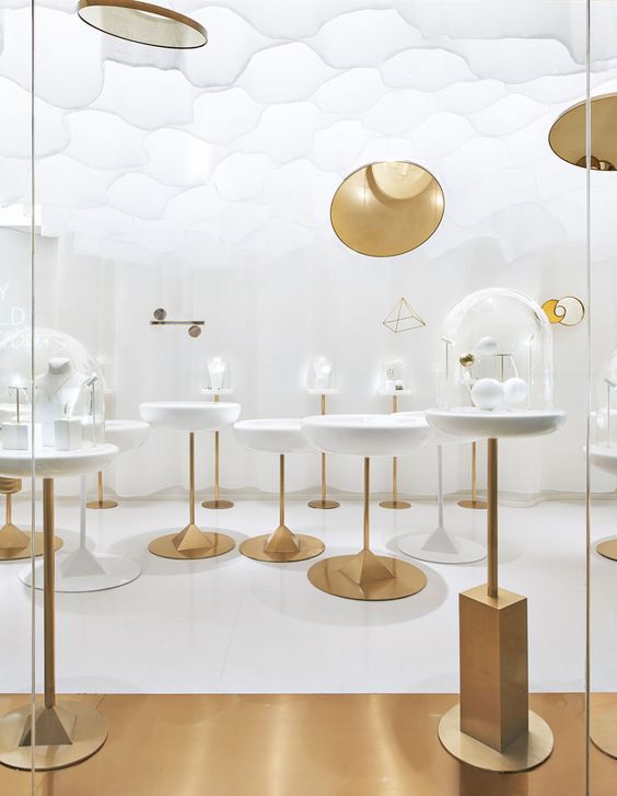
The combination of white and gold elevates the design of this jewelry store in Beijing to a whole new level. The designer Okamoto Deguchi utilized a very small space efficiently by creating small circular pods of display clustered together. The shop conveys a more daintly feel with the use of light white fabric ceiling interspersed with hints of gold. The overall effect is surreal and gives the store a museum like feel. With the interiors a bare minimum, the attention is drawn to the product which is the right way of creating a backdrop for an item. Full points!
2. EARTHINESS
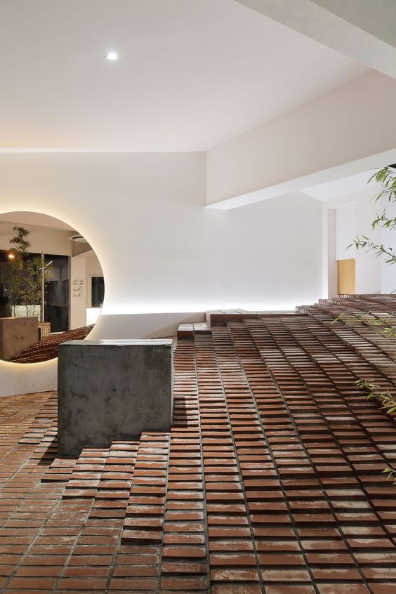
Some stores speak of the essence behind the idea they sell. Eco-living and sustainability goes well with concepts like herbal products, furniture, minimalist fashion boutiques, restaurants etc. A beautiful example is this retail interiors by Yellowtrace wherein they showcase an ingenious way to use brick indoors. Instead of the been there-done that bare brick wall, the designer uses the material in a fresh sloped flooring, creating an indoor amphitheater like effect. This tapering stage creates the perfect environment for promotional events, featured displays and customer engagement. And as long as there are bricks involved, you know you can’t go wrong.
3. CONTEMPORARY
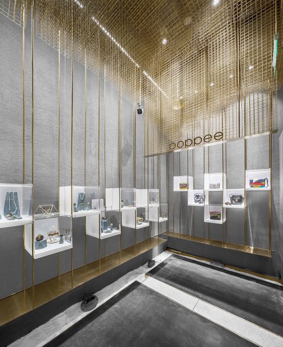
Oh grey, oh grey! When will you ever let me down? Maybe, never. It’s true, one can never be disappointed with grey. A neutral which goes with any shade and is the most contemporary classy shade to use in interiors. Pair this color with any other hue, material or texture, it comes out shining! In this instance, Atelier Cloud pairs grey walls with a gold pipe display which culminates in an intricate 3D mesh on the ceiling. The multi-level display creates a hierarchy of interest with the product and the starkness of the rest of the interior accentuates the jewelry even more.
4. SPLASH
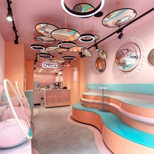
Going all out with colors and shapes and coming out with a winning design is way harder than it looks. This dessert parlor Doyce is a lesson in how more is more. Using circles as a central shape, the designer have played with elements like seating, wall accents and mirrors on the ceiling. The curved multi-level seating further highlights the length of the shop and conveys the layers of pastry. Being in this shop is like being inside a giant pink cake. Well, we are not complaining!
5. SUBTLETY
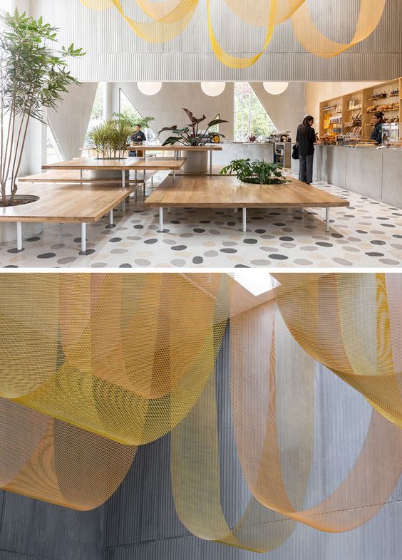
A complete contrast from the example above, this restaurant in Bogota by Studio Cadena believes in the simplicity factor. Beige and grey undertones in the flooring, counters and walls define the words ‘modern minimalism’. The hanging curtain ceiling at various levels draws the eyes upwards and creates the dominance in the interior space. Keeping the floor space stark and simple with a few planters and adding the wow above is ingenious. The wooden tables and shelves compliment the grey decor and the symmetry is just an added bonus!
6. OPULENCE
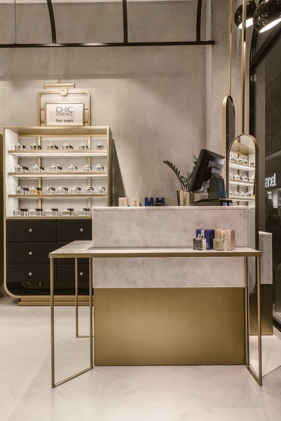
Rich chocolate brown or black paired with a matte gold finish furniture design spells Opulence. This luxury perfume shop by Marios Chadoulos brings back memories of a bygone era. The simple dressers and open display and the small cash counter is reminiscent of old times. Adding to that is the marble counter top and soft sepia wallpaper with the rounded vintage light bulbs. The vintage feel to any shop establishes the fact that the business is a trusted long running one. This theme goes well with luxury products like perfumes, watches, suits or jewelry. The decor in these shops is crucial to make the appearance even more realistic.
7. RUSTIC
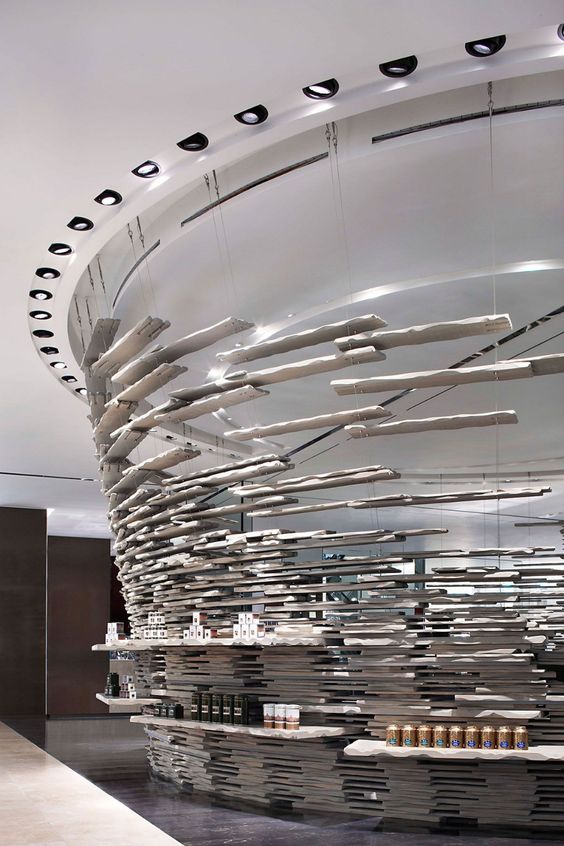
Yabu Pushelberg takes the conventional idea of a shop, twists and turns it and comes up with this brilliant retail store in a hotel. Away from the walls, this strikingly cool central display is an amalgamation of thousands of stone slats hung in a tapered cylinder from the ceiling. This creates levels of display like never before, in a rustic yet modern way. The spotlights around the installation lights up every product and creates a magnificent ambiance of light and shadow with the slats. The customer is free to walk around and experience the artwork shelf and really connect with the product.
8. WOOD
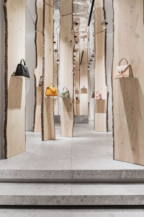
How can I finish a list of interior spaces and not mention wood? The enchanted forest themed retail interiors at Valextra designed by Kengo Kuma just makes me sigh. The verticality of the shop is showcased here further emphasizing it with the use of mirrors. The sliced and unfinished wooden panels go all the way up to the ceiling and have slits at various heights. These slits can be used to fix small glass shelves to display a bigger collection of bags if need be. The raw wood in all it’s glory is placed in an organized chaos path, letting the observer chose his own route around. The focal point remains the bag, with wall lighting presenting the product with clarity. What’s not to like?
9. ONE FOR INSTAGRAM
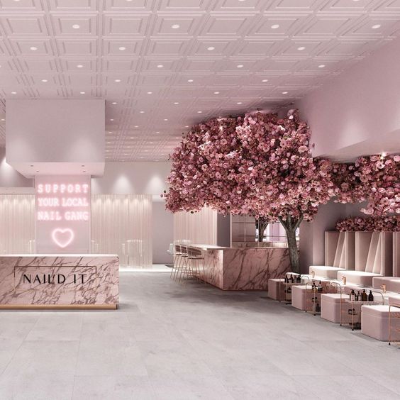
Beautiful decked up interiors and special elements like an extravagant chandelier, artwork, kinetic installation or even a well decorated tree during the holidays, gets people to take out their phone and start clicking. In the Instagram era, a store gets a lot of publicity on social media if their decor is clickable. Banking on this factor, the Nail’d it salon in Los Angeles features a full blossomed cherry pink tree and girly pink interiors for their clientele. No wonder, this salon gets so many eyeballs!
10. DIFFERENCE
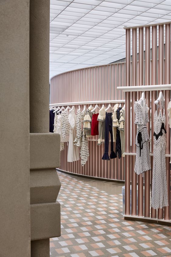
Once in a while we come across a truly different concept which is so ingenious, we are awestruck. The self portrait fashion boutique by Casper, Mueller and Kneer is one such example. A journey of a store, this statement in retail design, allows the customer to walk with the clothes. The start to end of this shop is like an art gallery, with the clothes treated as exhibits rather than product. The winding circular display let’s you walk amongst the brand and really engage with every piece as an individual entity. How did we not think of this before?
It is clear that retail interiors are a whole other ballgame than residential or office interiors. The trick is to entice and relate to the customer in retail design. Shops and stores these days are intent on creating a brand image to develop loyalty with the clients. Be it fashion, accessories, food or lifestyle, stores are catching on the trend. Making grand interiors which let’s the customer indulge in the world of that brand, expresses in space what the product stands for and makes one feel the essence of the item, is a trend here to stay. Hope you could learn something about retail design and get inspired from this curated list!
