
 Ever wondered how trends come into being? Trends, an amalgamation of colours and moods, end up dictating the style for every season. But what maketh these trends? A simple mechanism; the Trend Mood Boards. Every new season collection is often forecasted by a group that studies the current market and styles in detail, and the colours and moods that make this trend are depicted through Trend mood boards.
They are effective for designers in preparing a palette of colors and textures that can be turned into create winning designs. One of the companies that is at the foremost of forecasting trends is the Los Angeles based Design Options. For those who love to seek colors, trends, and moods as an entity, here’s a peek into their Color Trend Mood Boards for the Spring/Summer 2017.
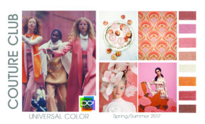
Couture Club – for the elite
Touted as the Universal theme and color, Couture Club caters to the lavish, luxurious and prestigious moods; preferably the elite. The colors are predominantly luxurious deep salmon saturations of haute couture with direct suggestions of freshness and bareness of the human skin. Apricot, light taupe, tangerine and shades of coral pink accentuate the dark mauve and nude backgrounds for this trend mood board.
Hot Tropics – for the little ones
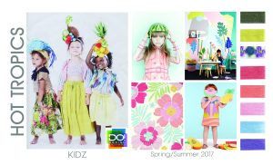 Accustomed to the fashion range in kids wear, the Hot Tropics is all about having fun in the summer with the cool pastel shades in the back drop. Lavender, Olive, Cantaloupe and light sky blue are the colors that can be sought to pep up the quirky, outgoing moods. This mood board highlights the Fresh fruit colors such as watermelon reds and pineapple yellow in the faded pink and blue knotted textured backgrounds.
Just one of the boys – for the men
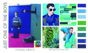 Charming, compelling men are good, but it is the season to be bold and defiant. This season these attitudes are represented by colors such as electric blue, shades of royal azure against shamrock green and light cerulean textures. Hues of powder blue also give away the notion of genuine creativity underlining the trend for just one among the crowd.
Nature Watch- for the nature enthusiasts
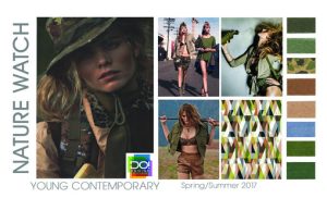 Created for the young and the contemporary, Nature Watch is representative of the mother earth. Forest green shades emphasizing leopard patterns, viridian and olive tones, flecks of baby blue on a backdrop of light brown are all indicative of evoking notions of multiplicity in a natural atmosphere. The patterns are natural yet techno because of the generation it represents. There is an implication of the techno folk fusion all along in this trend mood board.
Paradise Lost – for the adventure seekers
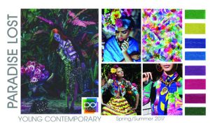 Again a trend that represents the young and contemporary but Paradise Lost is solely for the wanderlust – those who seek adventure and fantasies. Wild strawberry, shades of dark wisteria,ultramarine blue, shamrock greenare all colors representative to the moods of the wandering minds seeking for the lands of bliss in paradise.Psychedelic patterns in Royal azure and Violet red indicate unrestrained perfection andinspire hopeful notions of rediscovery.
Pattern Mix Up – for the beautiful home seekers
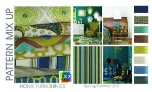 Home décor and furnishings too find a place in the trend mood board – Pattern Mix Up – a plethora of color and gathering of compelling shapes. Owing to a peripheral charm, the mood board is reflective to a quantum of ideologies surfacing from the ethnic fashion to contemporary geometry. Peridot and turquoise green shades, Pale cerulean and dark celestial blue tones are the colors emphasizing the eclectic appeal. Sepia tones and alabaster saturations fuse the proportioned contours of immaculate design.
These Trend Mood boards are arrived upon as a collective research gathering and usually forecasted by the mid of a year for the upcoming year. With an understanding of the above, the design palettes for the year 2017 do seek for a varied approach. But the beauty lies in the underlined subtleness in each of the trends. The Hot Tropics are not necessarily using the warm colors nor is the Couture Club necessarily in favor of the rich, suave textures or nuances. Seek the moods intangibly seems to be the trend all along.
The article was inspired by a piece on the same in FashionNetwork.
The color, texture and the designs are quite impressive. Someone will definitely enjoy having some of the above design. thank you for sharing.