There is Geometry in the humming of the strings, there is music in the spacing of the Spheres. – Pythagoras
It is high time designers breaking the mould of the solids and voids which make a space. Take the recent CyberTruck launch by Tesla. A shape, so unique in the automobile industry, the World had to sit up and take notice. Interior Design has also become a very set stage where the performance is more or less the same. We stick boxes onto boxes, squares and rectangles forming one space and we fill that space with even more squares and rectangles. Is space limited only to one shape? It’s time to generate more geometry in interior design and play with shapes. As Zaha Hadid famously quoted, “There are 360 degrees. Then why stick to one?”
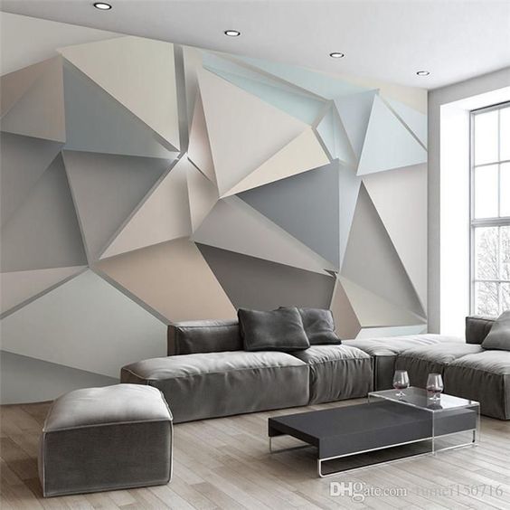
When it comes to living spaces, we tend to stick to the safer volumes, with more complex geometry adorning the walls in terms of art, patterns or cladding. The furniture, windows, fixtures etc. are also in similar straight lines to suit the surrounding shape. Is there a way to introduce more complex geometry in living spaces, without emptying your pockets? A simpler technique to achieve varying volumes without overdoing it? Let’s study some interesting examples of geometries in interior design and get inspired!
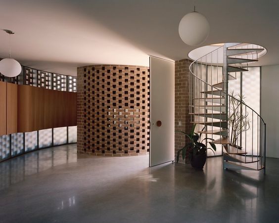
One of the easiest ways to break the monotony of squares and rectangles is to go with a fancy staircase. The vertical form of a staircase is a buffer for the eye in any space, and giving that a striking shape pulls the eye from more boring details.
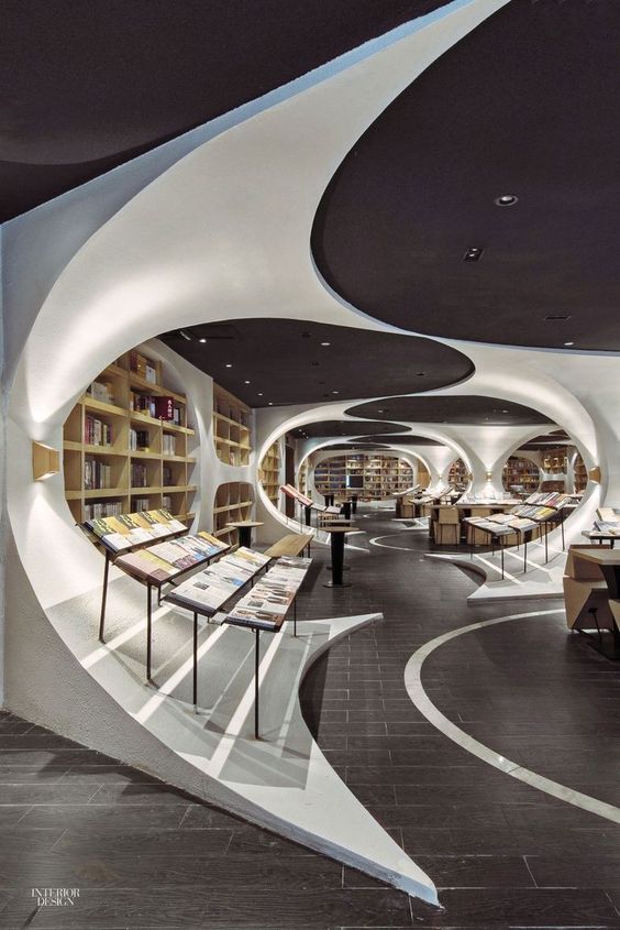
Another element in interiors which can be easily played with are columns. Columns provide bays in the inner space, and these bays can be treated with different geometry for a unique look. This book store uses RCC columns, reminiscent of bridge columns with a tapering bottom to form displays inside. In the middle of these bays, are simple rectangular shelves to display collections, but owing to the distinctive shapes of the columns, it doesn’t look boring.
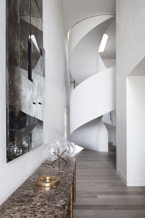
This winding staircase at the end of a tight rectangular corridor, by Jolson for the Arc Side Project also elevates the interior design with stark contrasts in configuration, both vertically and horizontally.
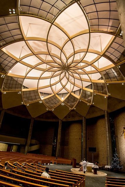
The St. Ignatius Church in Tokyo also uses a huge flower shaped light installation at the ceiling to emphasize the radial geometry of the space.
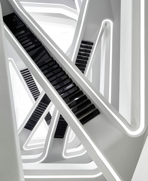
The Dominion Office building in Moscow by Zaha Hadid Architects is a fine example of experimenting with geometry. This illusion creating vertical transition design, is a far from being conservative. The zigzag orientation of the stairs create a sculptural feeling and goes to show how changing the forms and orientation of simple design elements can make such a difference to the space.
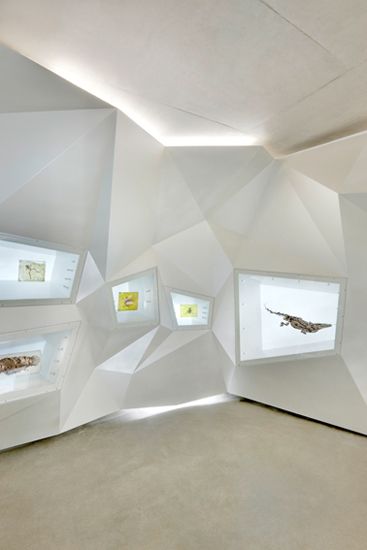
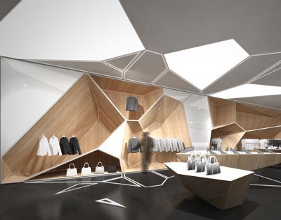
The examples above show how display can be done in a complex configuration. The varying polygons with different heights, angles and projections make for an engaging retail experience. The Visitor center in the first instance has screens installed in a more convex polygonal cladding whereas the Apparel Store in the second example uses a more concave design, wherein the voids become the display niches.
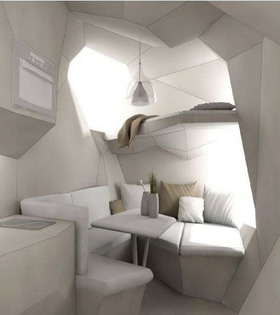
This Modern Home breaks the set image of a dining cove, by distorting the circular or rectangular seating into a more angular form which goes in and out, with a relaxing space above. This cosy nook is an example of how even the tightest spaces can be played with using shapes to fit activities.
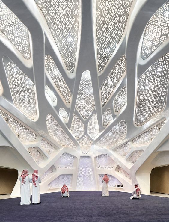
The KAPSARC Campus in Riyadh by Zaha Hadid Architects integrates the wall and ceiling design in a beautiful screen pattern fixed in soft edged polygons.
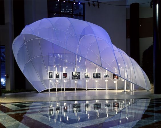
A temporary exhibition stall uses intersecting vault like structures in fabric to invite people in. The two tiered vaults create a special play of volumes and a hierarchy in the display.
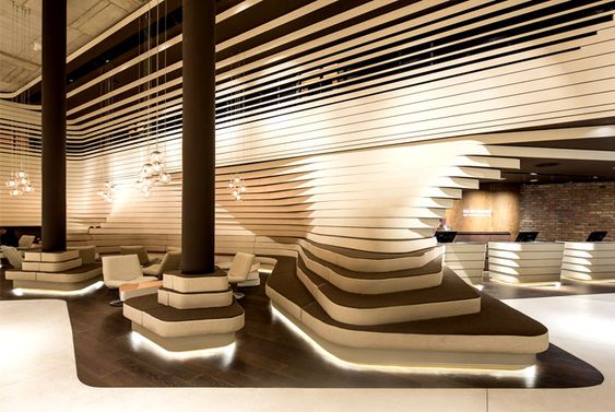
The Beograd hotel lobby by CRAFT uses lines and volumes effectively to create this amazing interactive space with different levels and seating options.
As more clientele wants unique, experimental designs, we need to rethink the idea of spaces and how we achieve them. The preconceived notions of right angles form the best spaces needs to go. The issue however in shifting to more bolder geometries in basic rooms is the non-availability of supporting furniture or fixtures. As a result, most houses and spaces look factory churned. This box methodology has worked well for mass production, as it is not possible to customize high demand products like curtains, beds, wardrobes, shelves etc. in thousands of shapes. Manufacturing processes for custom designed products is difficult and expensive, but in the long run it is more rewarding to have a space more suited to individual personalities.