
Of late, interior design has seen a major surge in the number of patterns, textures and materials being used. Gone are the times of plain, dull and boring walls. Creative imagery, eye catching motifs, wall art, decals etc. are in vogue. While some of us (read designers) have an eye for what will look good on which wall, the majority out there can’t efficiently pick something that will suit their space and thus end up with major wall disasters. So, in order to avoid such eye sores, here’s a complete break down of all patterns you can chose from to make your space look like a million bucks!
1. Patterns and Applications
Let us get to know the various patterns available, their nomenclature, and their various do’s and dont’s.
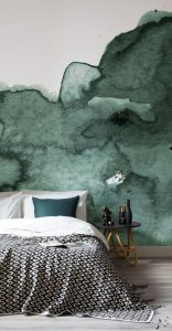
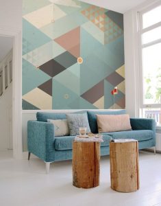
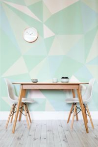
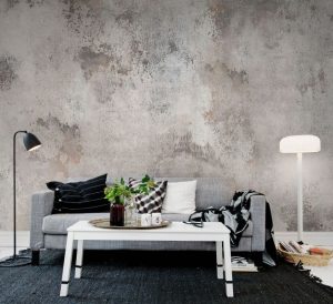
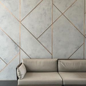
1. ABSTRACT / GEOMETRIC:
A slight gradient, shaded, or abstract overlapping geometric prints are on a rising trend in interiors. And rightly so! A shaded wall as a backdrop for a grand bed, or a geometric wallpaper with bold solid color furniture can make a space pop. It is evergreen, never gets boring and the chances of going wrong with shapes and hues are pretty narrow. The safest bet for any place, this pattern is a must have for your cosy reading areas, office walls, living/dining feature walls. These walls look even better with a great wall hanging such as a statement clock or pendant lights.
Do’s :
Start with the darkest pantone in the bottom part of the wall, and lighter to the top. Co-ordinate furniture and all other scheme complimenting that shade in the rest of the space. Add a contrasting art work to add dimension.
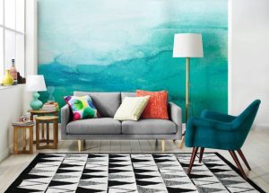
Geometric shapes and patterns should be used sparingly on a large wall. Introduce complementing materials and textures to give it depth. The supporting space should be in subtle undertones, so go with minimal furniture, solid colors, and fancy lights.
Don’t s:
Don’t use a busy and dark shade abstract pattern in a small, dark place, it makes the space visually smaller. Never pair fabrics, and other pieces with same patterns and textures as your wallpaper, or the patterns will clash creating visual chaos.
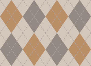
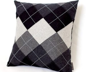
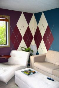
2. Argyle:
This classic pattern of diagonal checks (mostly seen on sweaters) is also picking up as a favorable pattern for interiors. The key is in using this pattern intelligently and sparingly.
Do’s:
Go for safe colors like shades of grey, interspersed with white bands. With the rest of the decor, one can go for a monochromatic scheme for a formal look for a guest bedroom, a lobby, or passage. Another spin to this pattern can be in terms of colorful furniture in a nursery or cafe. In case your space is too small, go for bigger checks (rather than tiny ones which might end up looking too busy), or stick to the argyle pattern in cushions or rugs.

Don’t s:
Do not recreate in a small cramped up space. Stick to shades of a single color, do not mix multiple colors to create the argyle.
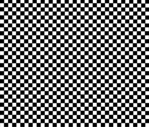
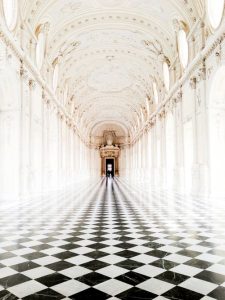
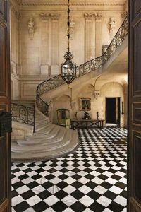
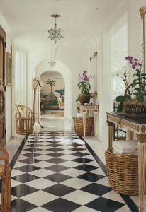
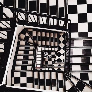
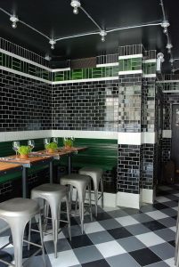
3. CHECKER:
Checks or checker pattern is the favorite among designers for flooring. Usually done in black and white marble, this pattern is perfect for grand hotel lobbies, office receptions, passages, and foyers. I would advise caution however while using it on walls, and in small rooms and stairs.
Do’s:
Don’t s:

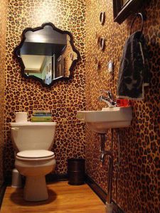
4. ANIMAL PRINT:
Needless to say, animal prints are bold patterns. Be it cheetah or tiger print, the lesser, the better. Use it to draw attention to certain elements of the room, like a rug, a stylish cushion or a wall art. Plastering walls in these prints, specially in small spaces is a strict no no, as they might end up looking very tacky and dark.

Do’s:
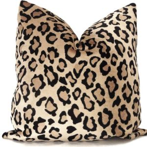
Don’t s:
Pairing classic designs such as floral, with animal prints is a strict no-no.
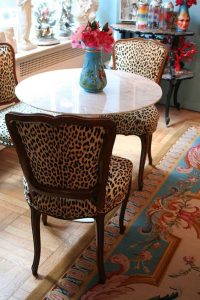
Needless to say, this just looks wrong.
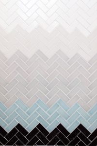
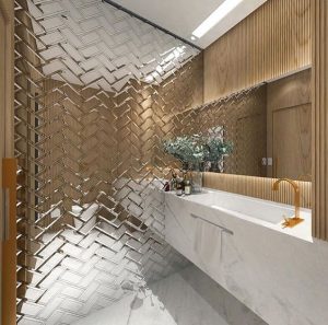
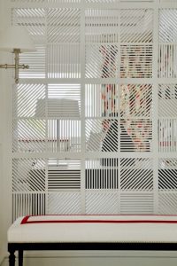
5. CHEVRON:
A top hit with designers in recent years, Chevron has great appeal in interiors. Be it a teen room, a hep cafe, a sophisticated boutique or bedroom, you cannot go wrong with chevron or its variations. Spice up the pattern using different materials and textures. Use in flooring, wall paneling, ceiling or fabrics, without hesitation. Keep in mind, that too much of something can be a problem and remember to highlight one element with the pattern, not all.
![]()
Do’s:
![]()
![]()
![]()
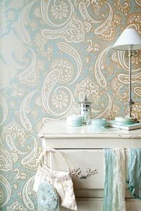
6. DAMASK:
A soft, feminine pattern, this is perfect for a boutique, teen room, 5 star suites or even classy bathrooms. This pattern is fluid and curvacious so remember to style other aspects in the room accordingly. Go with vintage or traditional furniture with curves rather than modern straightlines furniture. For a soft muted look, (in bedrooms) go for self print subtle wallpapers in damask pattern. For a feature wall look (boutiques/showrooms) you may want to chose combination colors.
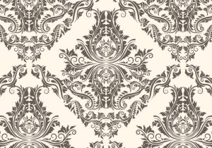
Do’s:
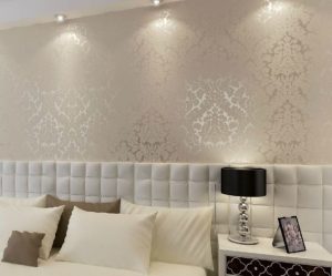
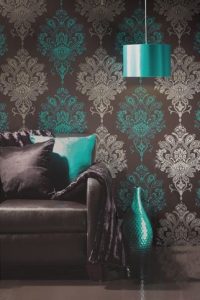
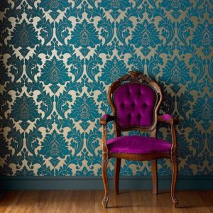
Don’t s:
The trick to using any pattern in a particular space is ‘knowing when to stop.’ Any space with all four walls in a single pattern, with equally busy furniture and decor is fated to look gaudy and loud. Using such an ornamented pattern all around may also risk the space looking like it has been gift wrapped.
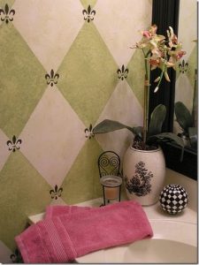
7. FLEUR DE LIS:
A pattern which hugely resembles the “Club” in cards, this also is a very flowery ornamented design. Bakeries, cafeterias, highlighter tiles are the best places to attempt this pattern. Use in curtains, drapes and fixtures for a classy vintage look.
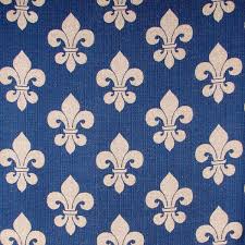
Do’s:
Create captivating walls by introducing patterns in a subtle and sober way.
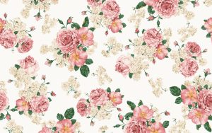
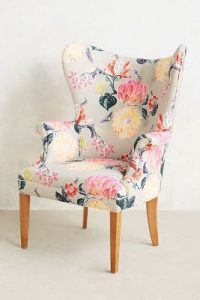
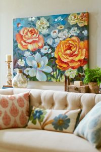
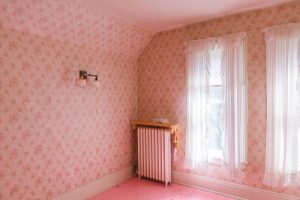
8. FLORAL:
Floral designs work well with shabby chic themes and add a certain wellness in a space. It is all the rage to use floral printed fabrics for winged sofas, accent chairs or love seats. They can also be used on walls in suites, common rooms, nurseries or bedrooms, showrooms. Remember to adorn only one major element in the space in this pattern. An overdose of this on multiple elements will look chaotic.
Do’s:
Don’t s:
Floral everything? No! If the walls, furniture, upholstery is all in the same pattern, none of it will stand out or read properly. The more is definitely not the merrier when it comes to floral in interiors.
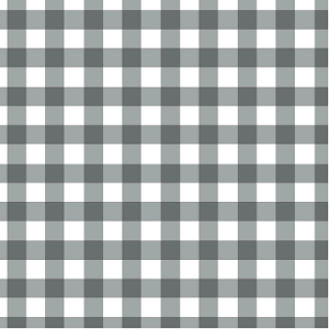
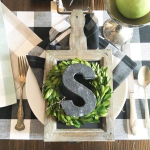
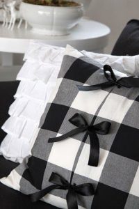
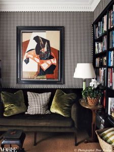
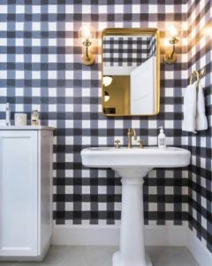
9. GINGHAM:
A variation of the checker, the gingham has three shades – black, white and grey. It is best used in table mats, napkins, cushions. Attempting the gingham on walls is risky business. A paint job in the gingham pattern can go horribly wrong if labor isn’t skilled enough, a wallpaper on the other hand runs the risk of looking over the top and boring in a couple of days. Stick to small items with the gingham.
Do’s:
Don’t s:
Black and white gingham in a small room, paired with dark furniture and flooring. Not a good idea.
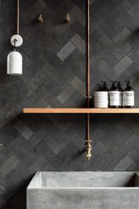
10. HERRINGBONE:
A hugely popular pattern for flooring, the herringbone is surely eternal. If used in the right material (tiles, mirror or wall paneling), this pattern can make a space look like a million bucks! Passages and bathroom flooring, dominant wall paneling, carpets or rugs, ceiling everything is a safe bet.
Do’s:
Always orient the herringbone in the longer side of the room to make it look longer (i.e. it shouldn’t be perpendicular to the longer wall)
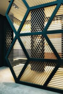
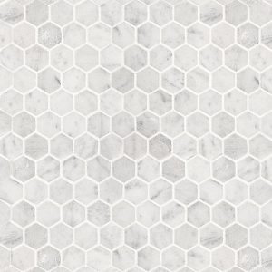
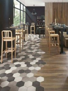
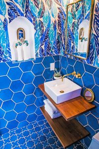
11. HEXAGON:
After chevron, it is hexagons which has caught every designer’s eye in the past few years. The honeycomb is a look everyone is dying to incorporate as it is one of the top trends in design these days. What with glass, tiles, mirrors, wallpapers, fabrics, shelving etc. being sold in hexagon shapes, it has become one of the sought after patterns.
Do’s:
Monochromatic shades for flooring and wall are advised. Spice up a wall with hexagonal shelving or introduce a partition of that shape for extra fun. Different sizes of hexagons overlapping with each other would also make a fantastic backdrop for offices, cafes, double height walls, theatres. Play the look with different materials and textures.
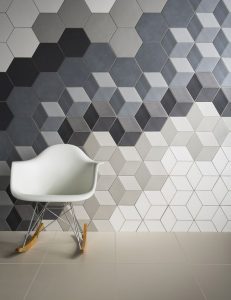

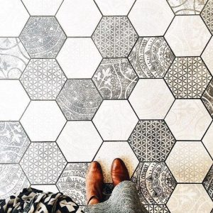
Don’t s:
Not everywhere. No. Pick one element, and show that off in any space.
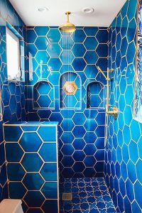
Feathers, hexagon and quatrefoil all in one room. I don’t think so.
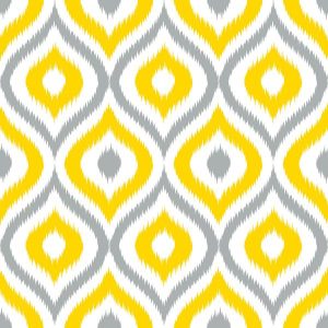
12. IKAT:
A bleeding, hand dyed look with minimalist patterns, ikat looks best on upholstery, curtains and other soft furnishing. Adorning walls with ikat can work for lifestyle stores, themed restaurants, playschools or personal spaces.
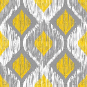
Do’s:
Go with primary colors and for best results chose shades which are normally seen on tie-dye items.
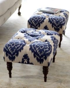
Don’t s:
Flooring in ikat isn’t a pretty sight to look at.
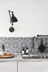
13. MOROCCAN:
A pretty and decorative motif, the Moroccan pattern oozes retro classic. It is best used in hues of blue and looks attractive as tiles, glass or wallpapers. Ideal spaces to use this pattern would be bathrooms, kitchen splashbacks or highlighters and themed restaurants (sheesha lounges). They are also a safe investment in rugs and upholstery.
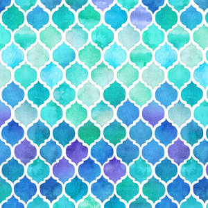
Do’s:
Moroccan tiles look best in glass and ceramic. Lighter and cooler shades are recommended.
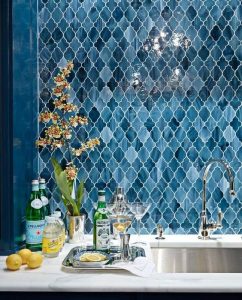
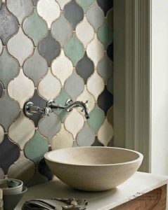
Don’t s:
Don’t pair Moroccan with floral or geometric patterns. Keep other elements either abstract or solid colors. Experiment with sequined cushions, detailed and curvaceous furniture rather than straight lined pieces.
14. OGEE:
A slight variation of the Moroccan pattern, the ogee is perfect for upholstery, soft furnishing and bedsheets, blankets etc.
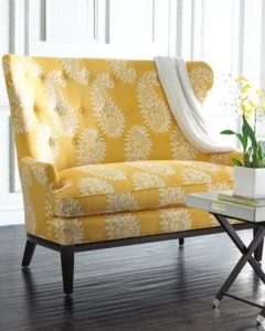
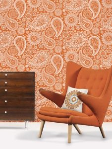
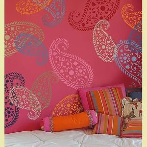
15. PAISLEY:
A very Indian motif, the paisley is a design best suited for upholstery and soft furnishing. In case you are a fan of the pattern, try and use it in soft understated tones, self prints instead of too many colors, on small singular walls, and pair it with solid color furniture and artefacts.
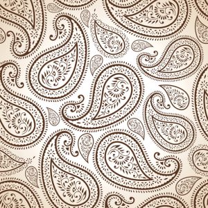
Do’s:
Don’t s:
Don’t go overboard with Paisley unless you want your walls to look like gift wrapping paper.
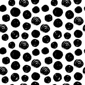
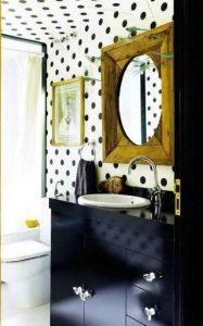
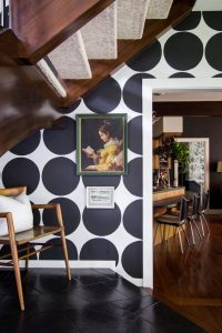
16. POLKA DOT:
The pattern seen on any and everything, the polka dot is universal and very popular. It is cute, lively and perfect for playschools, nurseries, bakeries, children’s stores, teen bedrooms, etc. It looks good on fabrics, walls, playful furniture, flooring, carpet or rugs etc.
Do’s:
Select the size of the polka dot according to your space. Dots that are too big or too small in proportion to the space being used, might look bad.
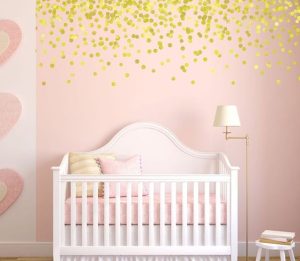
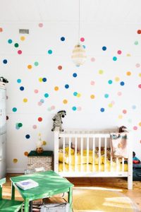
Don’t s:
Don’t go over the top with the polka dot. Don’t use it in formal spaces like offices, private cabins or meeting rooms. Limit its usage in small spaces.
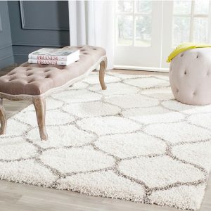
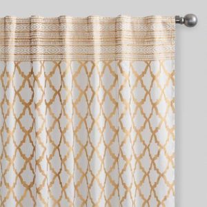
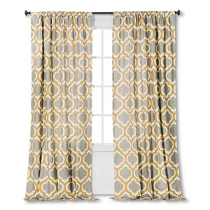
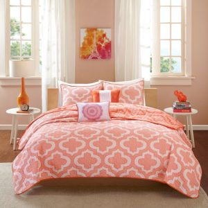
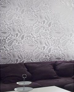
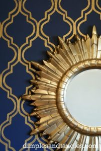
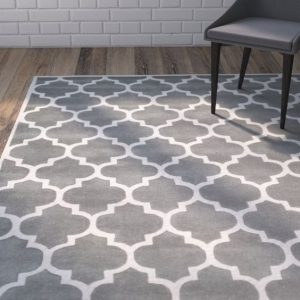
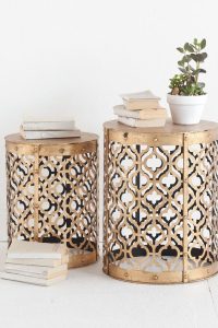
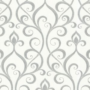
17. QUATREFOIL / TRELLIS:
The quatrefoil is a beautiful underrated pattern which is slowly catching on. It works well with partitions, (mdf or metal), for furniture, fabrics and wallpapers. You may also use a stamping system to paint the quatrefoil. Jewellery stores, grand baths, vintage spaces such as a study or cards room will be best suited for this pattern.
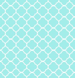
Do’s:
For a rich look, try painting the wall in a dark shade and chose a contrasting complementing color for the quatrefoil. Pair it with similar shade wall art, artefacts and lights. Navy blue and gold are our best picks!
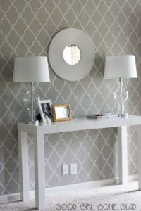
Don’t s:
Attempting quatrefoil on one too many elements in a single space can be a grave mistake.
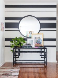
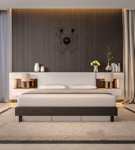
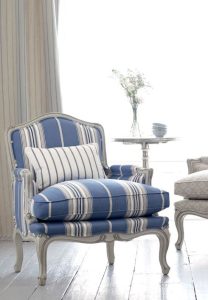
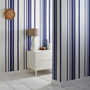
18. STRIPES:
Classic. Evergreen. Safe. Vertical and horizontal stripes as a pattern for walls, flooring, ceiling, fabric, furniture, upholstery has always been in vogue. The best thing about stripes is you can play with line widths and achieve formal, semi formal and informal looks. It is straight lined and thus goes with any kind of setting, furniture and design language. Play with colors as much as you want with the stripes. 3-4 colors of the room can be expressed in stripes. Going monochrome can give a classy sophisticated look.
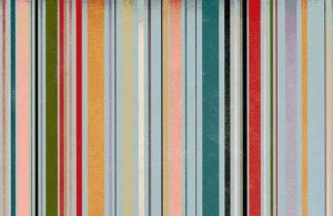
Do’s:
Choose vertical stripes for a room with a lesser height, and horizontal stripes for a room with a lesser width. Never, the other way around or the effect can be very boxy and cramped.
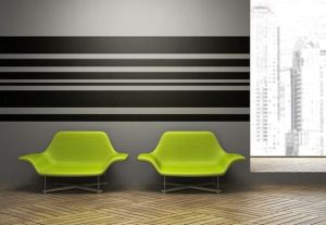
Don’t s:
Don’t use stripes for a wall which has too many indents otherwise it can be confusing and add more indents than there already are. Chose a plain wall. Never use bold stripes with another bold pattern like the checks or gingham.
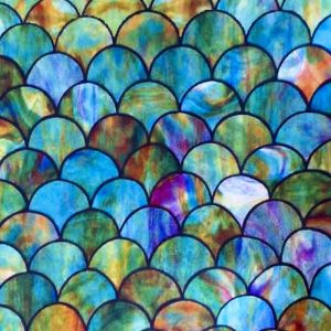
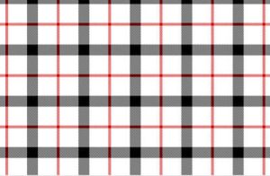
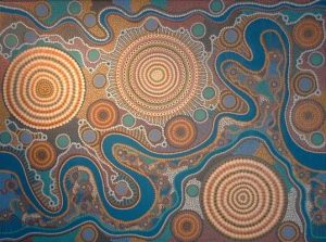
19. MISCELLANEOUS:
Other popular patterns are plaid, palmette, scroll, scales, aboriginal, etc. General thumb rule for using any pattern is too keep one highlighted element, pair curvaceous patterns with similar styled furniture and straight lined with same. DO NOT pair decorative motifs, floral patterns, ornamented designs all in one room.
That’s nice,I wanna get more knowledge about it.