Interior Design or Interior Architecture is multi-faceted. It has many aspects to it, aesthetically and technically. In the previous blogs, we have discussed lavish sprawling interiors, cozy and tiny spaces, grand staircases, retail, residential and restaurant interiors etc. But, what happens when you mix all the above? When you introduce steps and levels in residential and retail interiors? The result is a stunning set-up which adds interest aesthetically, creates more spaces and more scope in interiors technically and basically elevates the design. (Had to). So, lets look at some innovative examples of how we can play with levels and heights in Interior Design!
1. TIGHT SPACES
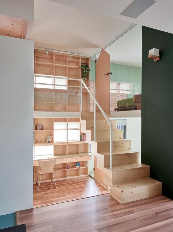
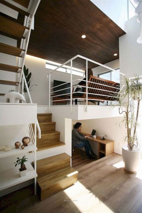
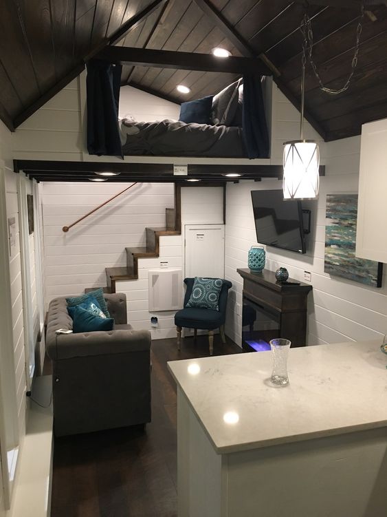
Small spaces, are by far the most benefited by multi-level design. A tiny space with a lot of requirements can still be salvaged if it has a good height. This allows Interior Designers to fit amenities and spaces vertically, rather than horizontally which is a good alternative to sprawling interiors in tight spaces.
However, before one starts piling every space on top of the other, you have to strictly consider the minimum height requirement for each space. For instance, a bunk bed in a kid’s room, has to be comfortable, airy and roomy otherwise one would just end up with a series of uncomfortable non usable spaces.
2. Leading up
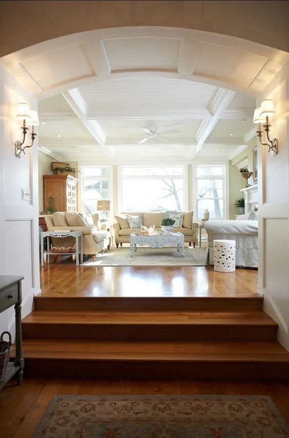
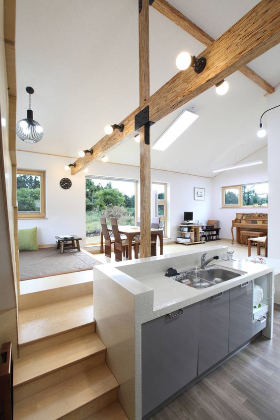
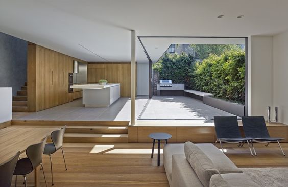
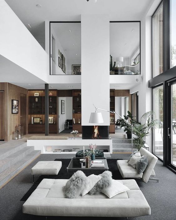
A level difference of 2-3 steps in interiors, is usually done to suggest a leading up or build up to that space. For instance, lavish living rooms usually are stepped down or up. This is also done in huge open planned residences, where the steps create the visual indication of change of space rather than walls.
3. FUN WITH LEVELS
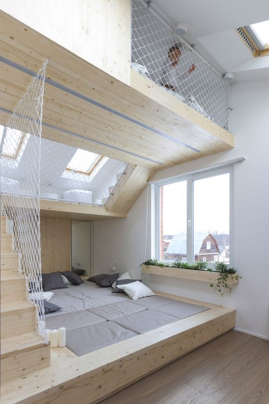
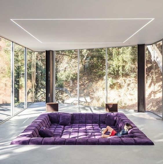
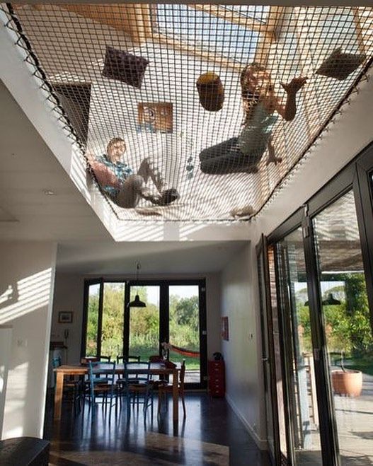
Why so serious? Interior Design can be modified to suit our needs, lavish, informal, fun, awesome! There are no boundaries. So, why not introduce some lively spaces in our houses, just for fun! This is the best way to make memories in a household, by creating innovative cosy spaces, where the entire family gets together. This use of levels, is simply ingenious.
4. STEPPED SEATING
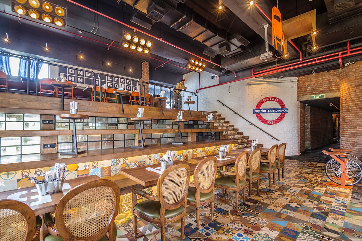
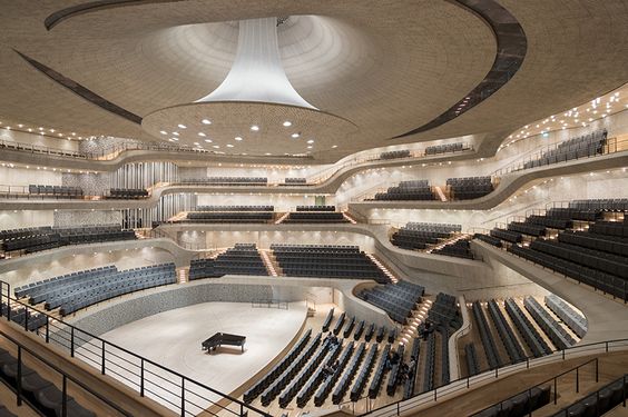
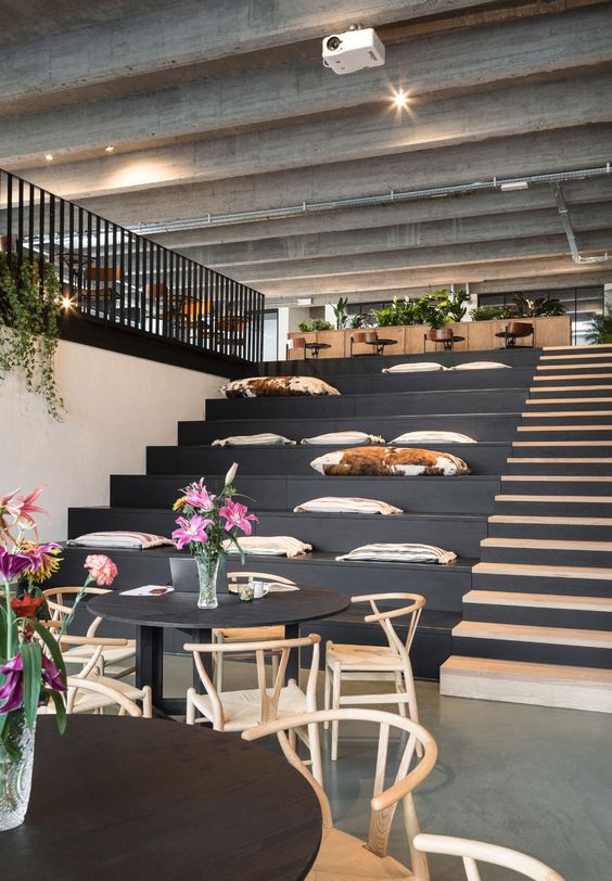
One of the easiest yet coolest ways to introduce levels in interior design is stepped seating or amphitheater style seating. This is a rising trend, as we see this kind of leveled seating in offices, hotels, clubs and bars. Amphitheaters are an outdoor concept, but when it looks so cool, why not integrate in good height interior spaces? This kind of seating, opens up a lot of different elements, like improving aesthetics, creating more than one angle to look at the space and choice for sitting. This therefore works best in commercial or office interiors.
5. BEEHIVE STYLE
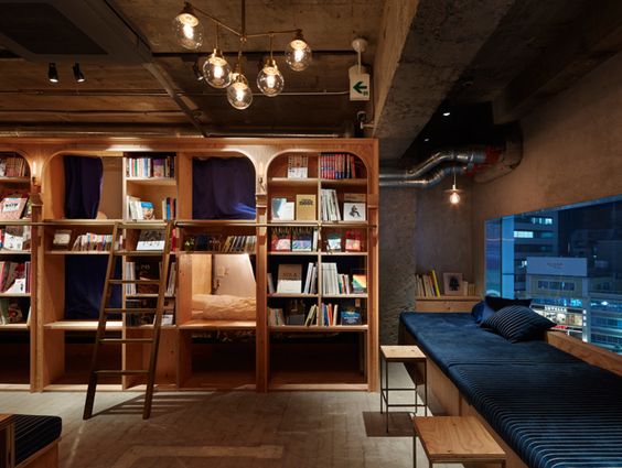
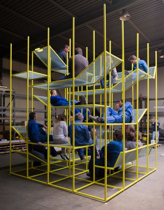
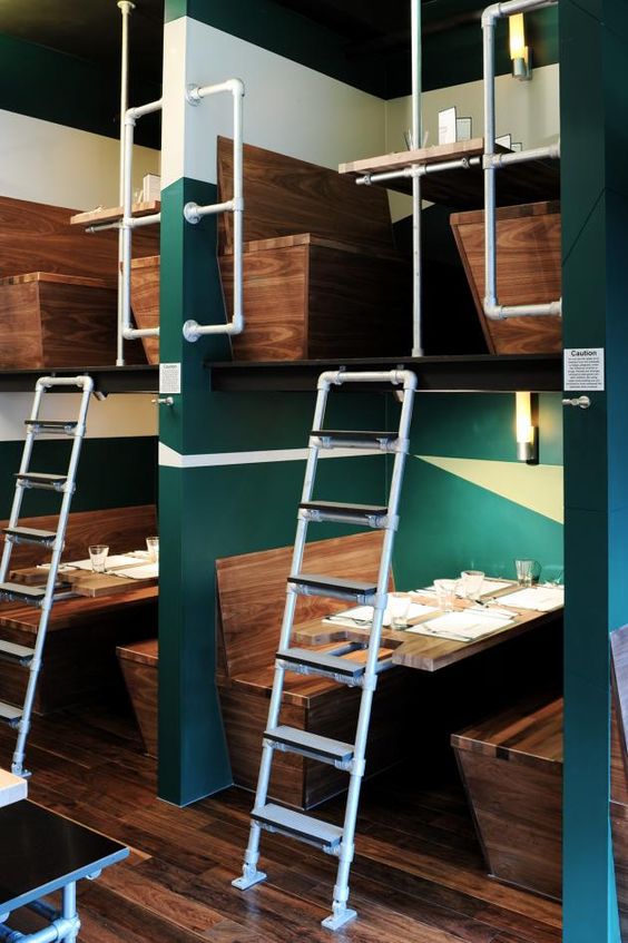
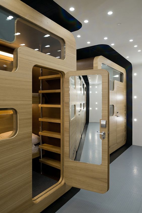
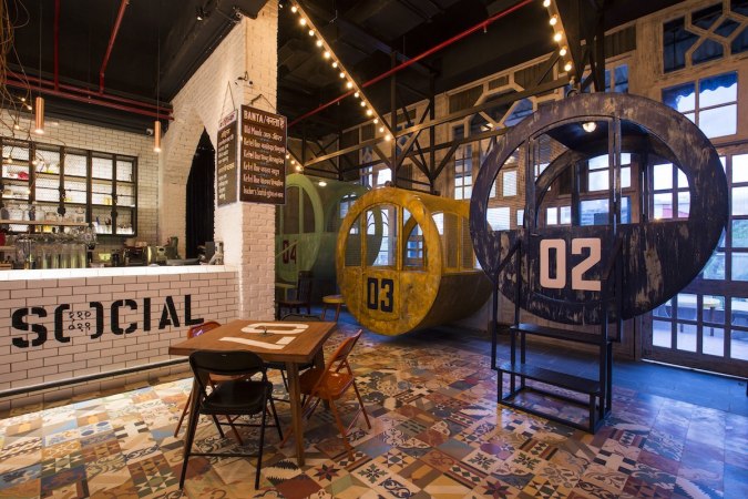
Ok, this isn’t actually called the beehive style. The play of levels in this case, is not by steps or creating levels, but by creating compartments or stand alone leveled structures. Hence, the beehive reference. This is an interesting example of play of levels, as it highlights that it isn’t necessary to integrate the entirety of the space in the design of levels, but even one small portion of the room can have these cosy elevated corners. It can be in the form of a bookshelf with a higher seating notch, or a stack of seats, or just compartments with level differences. Everything is possible if you just believe!
6. ILLUSION OF LEVELS
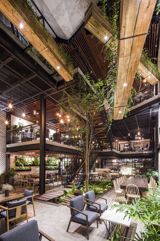
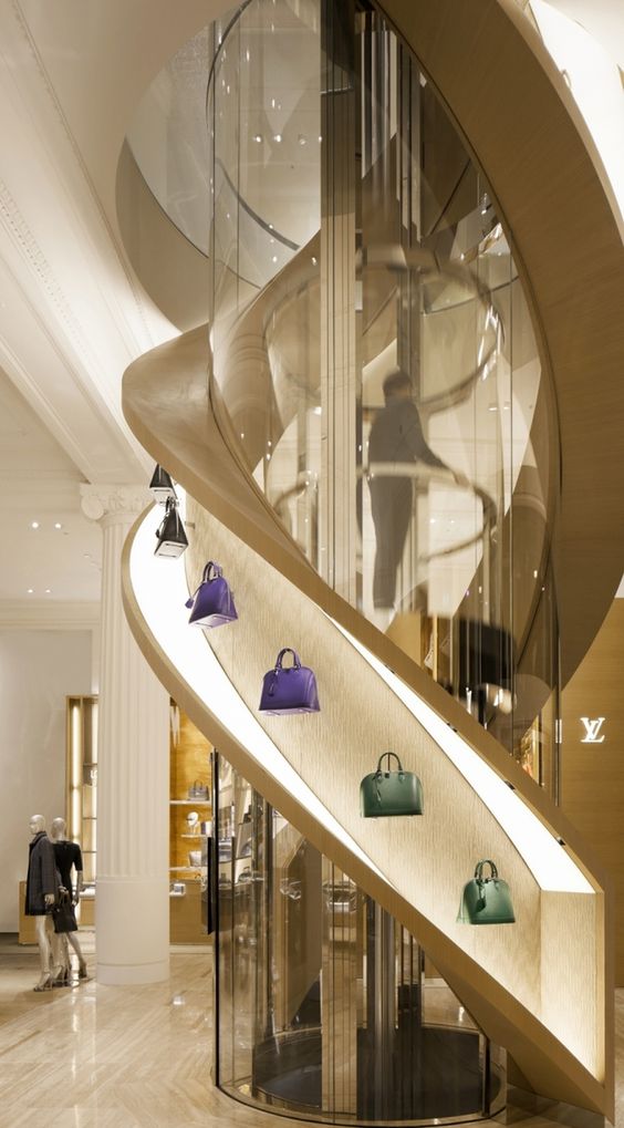
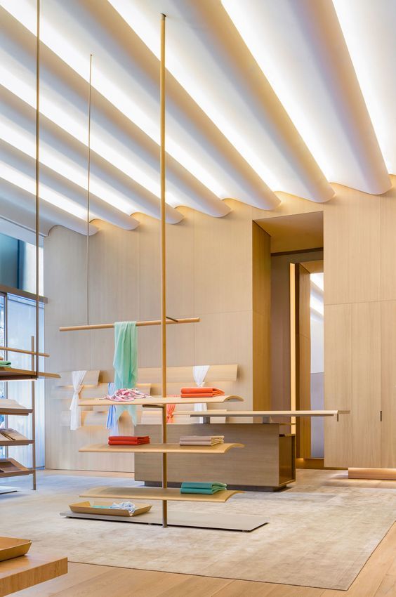
It’s not possible to integrate levels in every site and interior situation. So why not fool the audience?! This is done in retail interiors a lot, where the asymmetric or harmonious styles of display in different levels with a lot of mirrors around, create an illusion of levels and height differences. This is an interesting style to play around with as the permutations and combinations are infinite! Also, the first example showcases how they’ve created internal levels in the restaurant. The elevated level is nothing but a mezzanine or a different floor altogether, made to look as another level, with the double height adding to the illusion. By keeping the ceiling fluid in the entire space, and cutting out one portion as double height, the separate floor or the upper gallery as one can call it, stands out rather as an interesting play of levels.
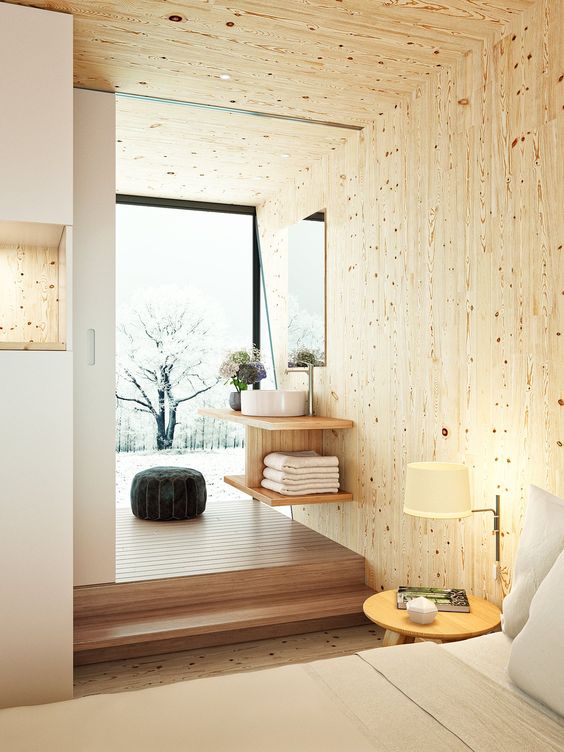
Creating a step in interior spaces, can also be used for the same purpose as a false ceiling; to hide services, pipes etc. This can also be used for additional storage or secret spaces. An interest mix of flat and level spaces, adds more fluidity to the space and in essence guides the user while creating a hierarchy of spaces indoors. These innovative ideas can be applied to all types of spaces, but it is strongly recommended to hire an interior designer who an guide with the process and take care of height and space standards.
