Often we see gorgeous images of interior spaces on the internet but can’t really pinpoint what makes the space so attractive! Want to be in on the secret? There are some tricks of the trade which Designers use, to come up with stunning designs, graphics, spaces or buildings every single time. What are these thumb rules and how do designers influence the people using the space? How an artist gets a viewer to look at a certain spot or notice a particular element is the trick in this case! Today, let’s go back to the basics where I divulge the Principles of (Interior) Design!
PRINCIPLES OF (INTERIOR) DESIGN
Creating any space, is akin to creating a work of Art. Thus, the rules we follow in producing graphics, artwork, interior spaces are more or less the same. We can identify the same characteristics in a painting that we might encounter in an Interior Design. However, things do get a little more complicated when you imagine this principles taking shape in 3D. The principles of design in art are a little more out there, a little more easier to spot. However, the ones in Interiors are a little more abstract. So today, let’s learn all the terminologies of these thumb rules and study the examples to fully comprehend them.
1. BALANCE
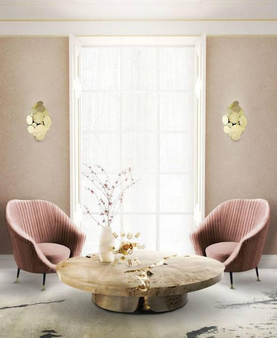
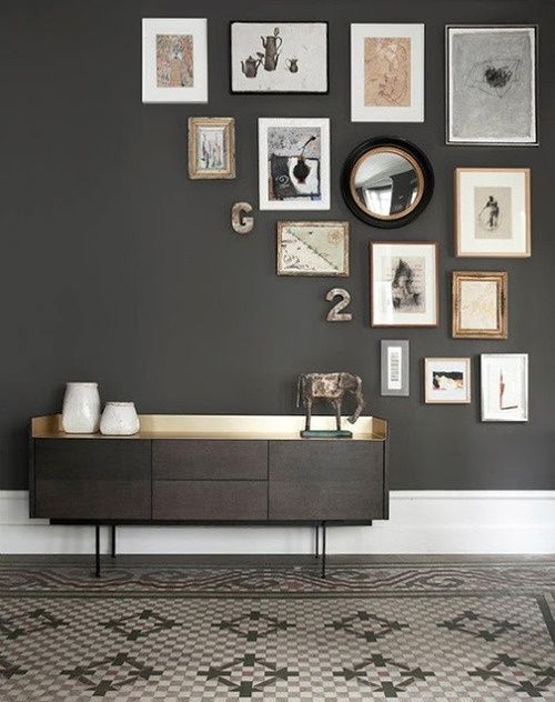
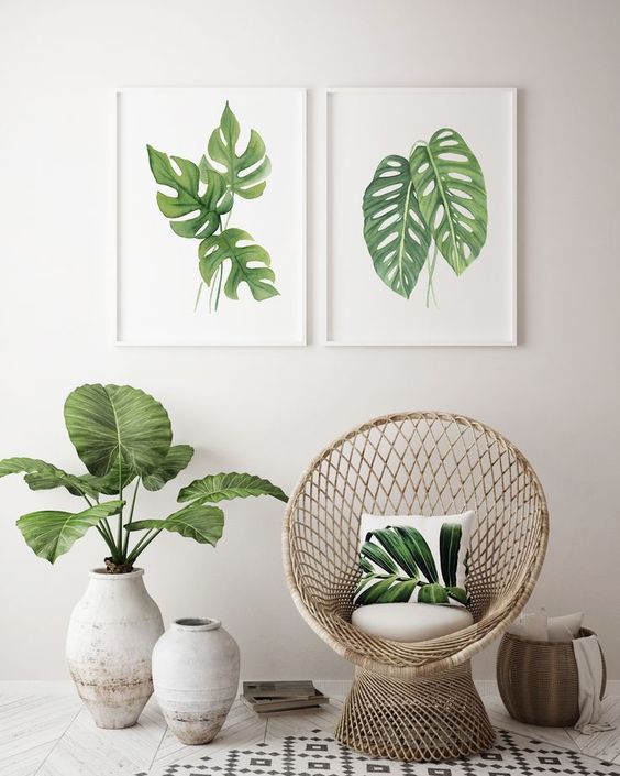
Study the above examples carefully. Why do they look so satisfying? I specifically picked flat elevation images to make it easier for you.
The answer is creating the right Balance. Organize the elements in such a way that it distributes their visual height in a pleasing way. Balance, however, doesn’t mean symmetry. Take the second image for instance. The visual weight of the tapering display of pictures is balanced perfectly with a heavy dresser at the bottom. This picture, though not a mirror image (like the first one) or symmetrical, creates the perfect Balance.
2. GRADATION AND PROPORTION
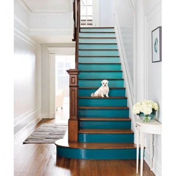
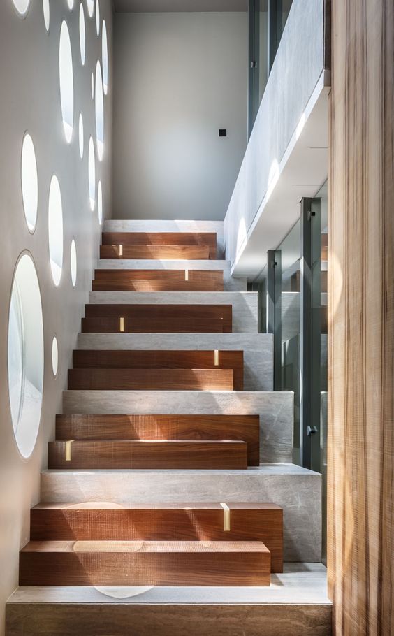
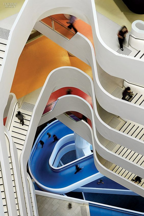
Gradation creates interest and movement in a space. It provides the linear and aerial perspectives when added to different elements in Design. When applied to 3 dimensional spaces, one can use gradation and proportion in various ways. Not just in colors, but in levels, heights, masses etc. we can achieve gradation in Interiors.
3. REPETITION
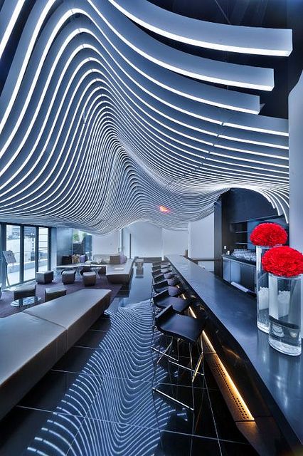
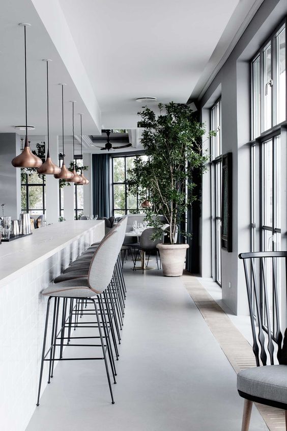
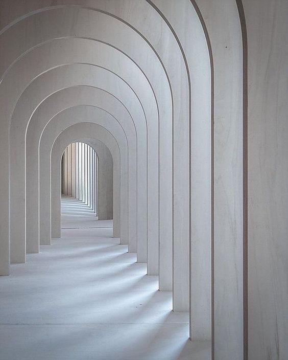
Repetition is used in almost every Interior Design to create a symmetrical balance. It’s a formal, well- structured and can be boring if used too much. Repetition can look brilliant if it’s used to create patterns in 3D. This works both ways as it creates frames and shifting views and also different patterns in 2D. Repetition, thus works very well in bigger spaces or larger scales in Design like parks, corridors, staircases etc.
4. CONTRAST
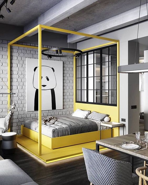
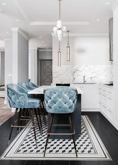
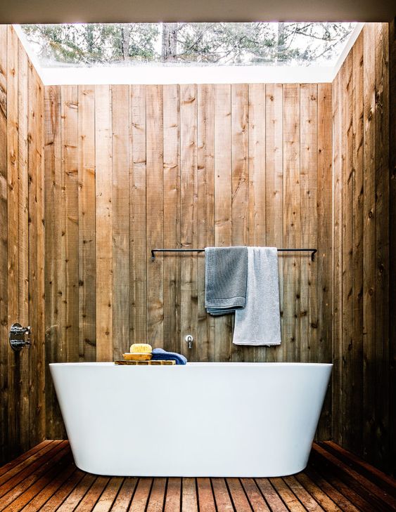
Contrast is one of the most commonly used design tricks to draw attention to certain elements or create interest in the space. Contrast can be achieved easily by different colors, or by adding a splash of color in a monochromatic space. It can also be done by mixing styles or textures, but one as to be careful while doing this. For example, mixing antique chairs in a modern setting, or a vintage lamp in a contemporary space, or a bare brick wall in soft interiors.
5. DOMINANCE / EMPHASIS
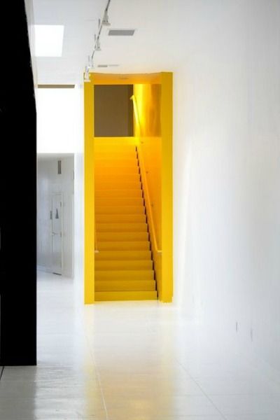
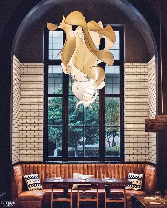
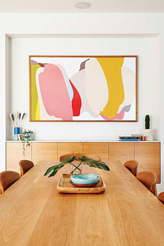
There is something in each of the above pictures, which instantly catches your eye, or is the first thing you see. In the first picture, it is the yellow painted staircase, in the second it is the light fixture and in the third it is the painting which commands attention. This design principle is called ‘Dominance’. It is used to create a focal point or point of interest in the space. This emphasis created in the design is a great way to subtly add glamour, color or elegance in the space.
6. UNITY
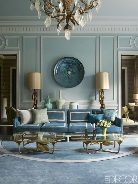
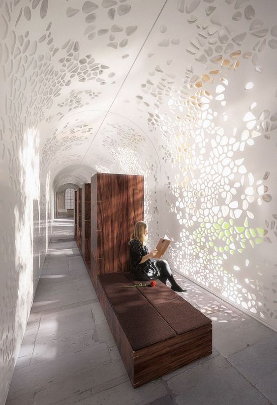
What makes a space look wholesome? A well designed space is a piece of Art. Therefore, every element in that art piece, should belong there. Additionally, every element should be treated as a single entity. That simply means, the ceiling, the flooring, the furniture, the colors, the art pieces and soft furnishing should be of the same family. Now, same family, doesn’t mean everything needs to be over matchy matchy or in the same color etc. It just means, that everything compliments everything else and adds value to the overall space.
7. HARMONY
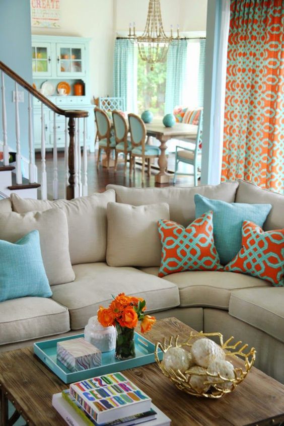
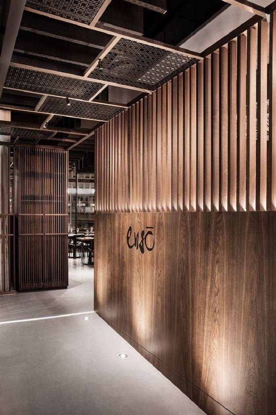
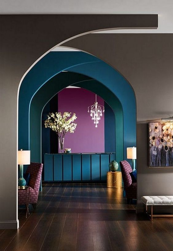
Harmony as a design principle signifies the effective blend of related elements such as shapes, colors, etc. in a symmetrical or asymmetrical design. It basically reinforces the idea of space as a wholesome entity. For instance, in the first example, similar colors and patterns are used (sparingly) in the overall design to create a sense of fluid spaces. In the second image, repetition and harmony combine different shapes and planes with the same texture i.e. wood. Repeating motifs, colors or specific elements like arched doorways, or similar door handles, or one flooring throughout the space, similar materials or even the same theme or style of design in the house connects the entire space in harmony.
The above rules or principles of design are not standards, they should just be a recurring thought in your mind while designing. Some designers intuitively or unknowingly follow these rules in their creations and thus produce amazing outputs. Practicing these design principles in everyday home decor, designs and art can uplift your work and sharpen your skills multifold!
